

Creating glyphs: a product design skill recipe
source link: https://uxdesign.cc/glyph-design-product-design-skill-recipe-ff04268b3f75
Go to the source link to view the article. You can view the picture content, updated content and better typesetting reading experience. If the link is broken, please click the button below to view the snapshot at that time.
Creating glyphs: a product design skill recipe
Creating glyphs is, for me, one of the most joyful activities of Product Design. The activity distills so much of the craft into a tight series of constraints, making each piece a small puzzle to solve in software and graphic design. Each glyph telling a small story that creates signifiers and affordances — fancy words for labels and hints — to the users of your products.
The reason I choose the word glyph instead of icon, is something I picked up while working at Apple. At first the term sounded snobby for the sake of it, but when I looked closer at the definition of the two words, glyph seemed more appropriate. Many times what we have to craft for an interface is not in fact some enduring iconic symbol, but a subtle collection of lines and curves that imparts information nonverbally.
Today, we’re drowning in resources for ready-made icons. I even leverage sites like The Noun Project, SF Symbols, or collections from design communities as inspiration for my own work. There’s no shame in using externally-developed resources, but ready-made assets often fail to meet the exact needs of complex projects. In my opinion, what’s worse, is that they rob the designer of practice, and knowledge. The amount of work it takes to create something simple, elegant, and clear is immense.
My recipe for creating glyphs is intended to be a complete guide for those new to glyph design, or a reference sheet for seasoned iconographers. I always recommend starting your glyph design with a hand-drawn tool, it will save you time and lead to better results in the long run.
Glyph Design Recipe
- Choose a communication goal
- Research standards
- Sketch options
- Create templates
- Form your glyph
- Extend your glyph
- Test your glyph
- Document
Instructions
I. Choose a communication goal
Choosing what to communicate is the most important step. If you don’t know what function or action a glyph is intended to communicate then you will not be able to render something useful. Whether your glyph communicates something simple, like “back” or “add” or something more complex like “enhance multiple properties of this image” having a communicational goal will help you hone your glyph down to the essence of its symbology.
II. Research standards
Take some time to explore books and resources that expose you to the symbols associated with your communication goal. If your product is being used in counties and cultures outside of ones you’re familiar with, you’ll want to extend your search to include historical imagery from those places and cultures. Build a document to reference that includes the most notable examples of those symbols, and colors.
III. Sketch Options
We’ve used glyphs to communicate with each other for thousands of years, and my affinity is toward finding the forms that evoke the familiarity with the shapes and tools we encounter in our everyday lives.
While sketching, explore adopting and interpreting widely recognizable symbols from your research. Focus on creating forms that are unambiguous, and work at small sizes or far away. For a basic symbol, somewhere between 2–5 options will suffice, more complex metaphors may take dozens of iterations or more to arrive at an answer.
IV. Form your glyph
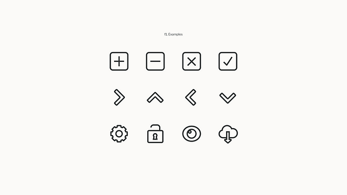
If you’re starting a new project from scratch, create a small template you can use to build all future glyphs upon. I will typically create a small 16pt and 24pt or 32pt square canvas to render glyphs upon. Achieving sharp and precise forms, free of fuzzy sub-pixel aliasing requires hand-tweaking your glyph across multiple size “classes” to ensure a crisp, and clean display.
When forming your glyph, there are many factors to consider. But the core rules remain the same. Form glyphs to be:
- Clear and unique
- Readable across various sizes and usage
- Consistent with the appearance and style across other glyphs in your product
- Visually balanced
One of the easiest ways of testing glyphs for clarity and uniqueness is the squint test. Stand back from your sketch, or screen, and squint to see if you can tell your icons apart. For those of us with glasses, now’s the time to take them off. If you can’t tell your glyphs apart, it might be worth it to see if there are pieces of your design to modify for differentiation.
Readability is an exercise in hand-crafting glyphs across multiple sized. You will likely need to shift elements by hand to create glyphs that will be visually centered, and work in multiple contexts such as in buttons or in-line with text.
Building a library of consistent glyphs will begin to form a visual system. If you are building towards a system that is fun, exciting, and engaging, it may be apropriate to render glyphs with color, dimension, and detail. A more minimal systems may call for clean lines, and monochromatic rendering.
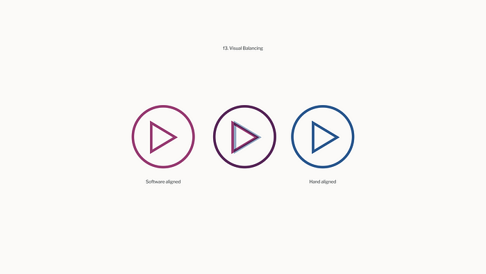
Visual balancing requires the understanding that many shapes and curves do not look beautiful and symmetrical when relying on software’s mathematically-precise alignment tools. A classic example is the standard video play-head glyph. Above, you can see that the mathematical center of the triangle actually creates visual imbalance. Since we perceive the left side of the triangle occupying more space. Visually balancing by hand can overcome the awkwardness of software alignment and create more beautiful forms.
V. Extending your glyphs
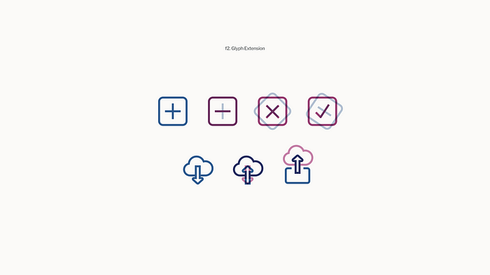
Extending your glyphs is a piece of work that most benefits the simplest forms in your system, it involves taking simple forms that you create, and crafting additional geometry around them to change the context of the glyphs. For example, if a user can add multiple types of things to the system, you could create a single “add” glyph, but if those functions are to be presented in a way that requires the user to choose between them, extending your glyph is a way to communicate relationships and distinctions.
VI. Test your glyphs
Once you have an asset that you believe is researched, clear, readable, consistent, and balanced, test your glyphs inside of interface mockups and prototypes. You need to see how it feels within the larger context of your system, and in various different usage situations. Glyphs that seem sound in isolation or in a grid with other glyphs, can fall apart in particular usages. During this process, it’s also helpful to question whether the weakness of a glyph is actually an issue with labeling or visual context like size, color alignment, or container. Many poor interfaces lack a sound pairing of good labels with well-formed glyphs. You should also test your glyphs next to each other in addition to in the context of an interface.
VII. Document your glyph
Document your glyph with a clear name, and some written documentation on it’s usage. When designing a system of glyphs, you may decide that you’ll approach your system in a concept-driven manner. For example “X” meaning “to do away with.” An “X” glyph in a conceptual system may be used to delete a file, or exit a window. Some also prefer a stricter function-based approach. That same “X” glyph may be labeled as “Close” and therefore would necessitate the crafting of a different form to represent a function like delete.
I have built several glyph libraries for various products across various companies in my years as a Product Designer. I have also worked on projects where time or resource constraints had me leveraging glyphs made by others. For me there is immense joy in opening a glyph library of my own creation, and mining it like a treasure chest to solve interface challenges in my products. There’s also joy in the discovery of an unmet need in my treasure chest, a whole new challenge that demands the creation of a new glyph, the invention of a new metaphor, and a chance to develop and extend a system of my own design. For creating glyphs old and new, I hope this recipe helps guide your on your journey.
Recommend
About Joyk
Aggregate valuable and interesting links.
Joyk means Joy of geeK