

11 Examples of Real World UX & What We Can Learn from Them
source link: https://uxplanet.org/11-examples-of-real-world-ux-what-we-can-learn-from-them-8ad18363b7e7
Go to the source link to view the article. You can view the picture content, updated content and better typesetting reading experience. If the link is broken, please click the button below to view the snapshot at that time.
#1 Secret Code Words
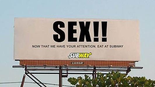
No words draw the subconscious attention as quickly as the two words Free, and Sex. Words have a great power over us, and can readily be used to direct attention and actions simply by stating them. Have you ever seen the words FREE plastered over a billboard and shot your eyes over to it? You probably have, or you’ve been living on a mountain! Advertisers and creators know this hack, and primarily use it for their own gain.
It’s not all doom and gloom, as this hack can, though rarely and with VERY careful use, be utilised ethically. The sample size for ethical usage of this is thin, and are what are known as benevolent deceptions which ‘trick’ the user into doing something that is beneficial to them. Take care when doing this, as very quickly if noticed and applied wrongly, will create a gap between the product and user and quickly generate disdain and contempt for cheating their subconscious.
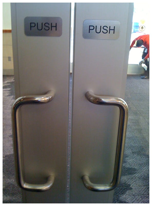
#2 Design = Function?
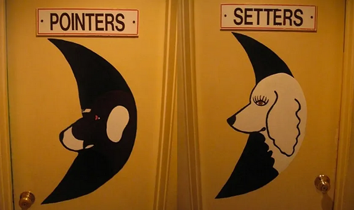
If you’re going to take an interesting spin on something, make it understandable. Creative liberties are great and give us the opportunity to not only challenge the boundaries of design, but create a personal brand that our users can interact with, however, there is a right and wrong way to do this.
The image above shows us a clear failure of this, and sure after a second or two you can figure out which is which, but that’s just not impressive compared the milliseconds it takes using traditional signs!
#3 Positive Reinforcement
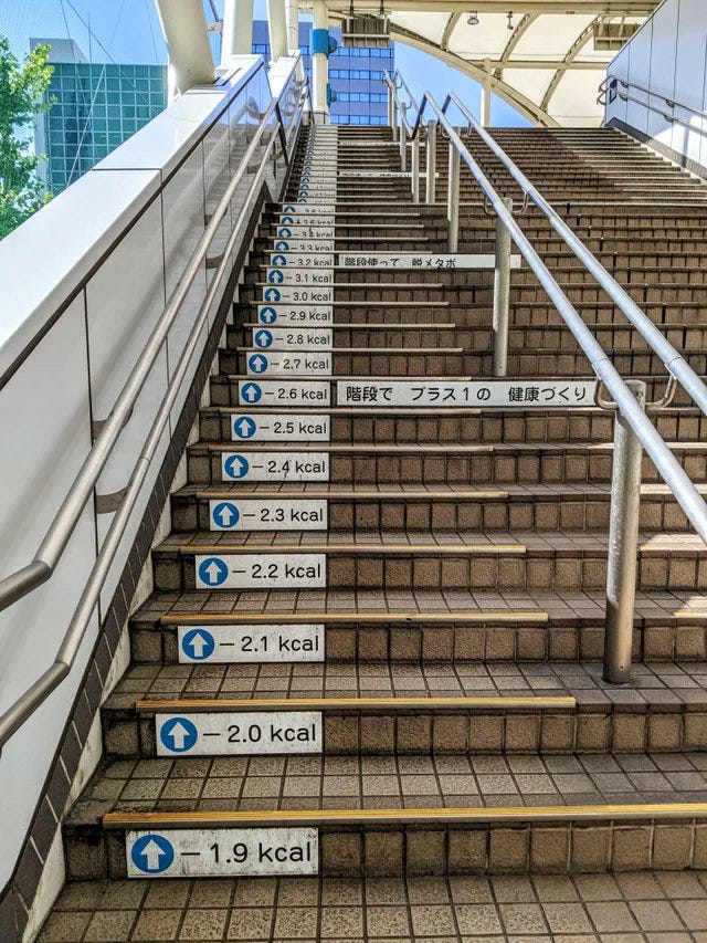
What’s good for us isn’t always what’s easy, and one of the most powerful tools to remedy and aid this situation is to provide positive reinforcement. What’s better than seeing the numbers on the scale fall when you’ve been diligently sticking to your diet? Or seeing your strength grow when you’ve applied yourself to a disciplined workout schedule?
Everybody loves positive reinforcement, there is no exception to this law, and that includes our users! Show them how their actions benefit themselves, their community, and the world around them. Did they shop vegan or consciously? Remind them, praise them, and by doing this we not only will spur them to continue with their efforts, we undoubtedly harmonise with our users!
#4 What You See is What You Get
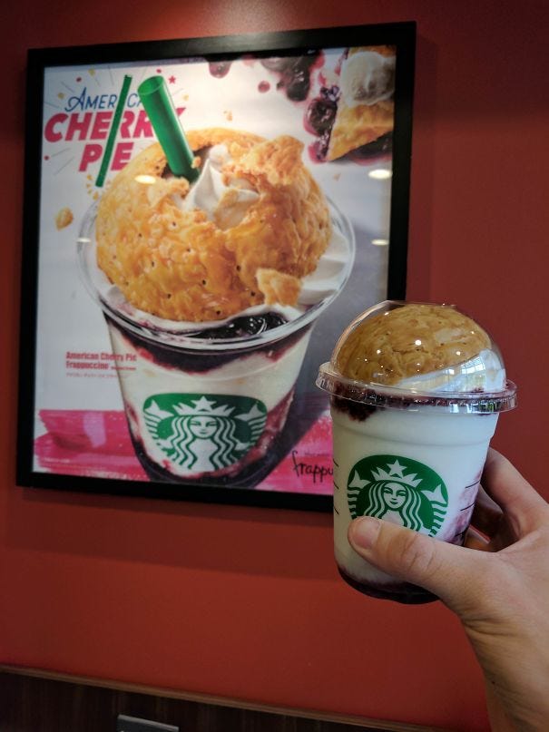
Promised an ice cream so tall that it slips off the edges, only to get a pitiful little sphere? We’ve all had it, and I’m sure I don’t need to remind you how it felt to see the result, you probably felt tricked.
If we intend to lie to our users, deceive them into thinking we can give them something we can’t, then we should also assume that not only will they not return to us, but they may also share this discontent with the world around them about what we’ve created. Brand image? Gone.
#5 Make It Accessible
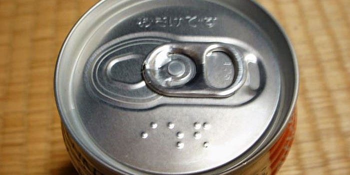
Error prevention at its finest from Japan, ensuring that users aren’t walking out of the store intending for a refreshing peach tea, to instead end up plastered on the sidewalk!
Whilst yes, it’s pretty hard to mistake beer for peach tea, the point here is that if we can prevent a user from making a mistake, then we’ve succeeded as designers.
#6 The Appeal of Colours

What was the first word you thought of when you saw this image? What thoughts and feelings accompanied it? Red is fantastic at drawing attention thanks to our ancestral brain accompanying the view of red to a variety of very important things, such as nutritional fruits and berries (which were our primary source of nutrition for a very long time!)
Usually, this colour can be used to the benefit of our users to direct their attention towards something, tell them not to do something, or to delete something. It has it’s negative connotations, but it’s strength is in how noticeable, and how alluring it is, wherein it is easy to see both it’s unethical and ethical applications
Every single colour has its underlying subconscious response, and I’m sure you can intuitively sense each such as green is good, natural, healthy, turquoise is peaceful, wise, imaginative, the list goes on!
#7 Pull, Pull, Twist?
Itt’s simple: Push = Plates, Pull = Bars, Twist = Bopit.
Don’t make your designs look like something else, when the operation is entirely dissimilar! The handoff for beauty over usability is one that frequently aligns itself with designers, and it’s very easy to fall into the trap, but we must always consider whether what is being created gives the user the correct signal, and they do not have to go through the process of error and rectification.
#8 Guide Your Users

When we want our users to go somewhere, it’s not always the right decision or even an option to force them into this. We as designers, can utilise soft psychological nudges to guide our users to the benefit to themselves when necessary, but it is important here to note that it’s done when important, and not when we assume it is of benefit. Research, research, research!
(Yes, that’s a urinal, and yes again it did reduce spillage and cleaning costs)
#9 What About Me!

Truly cognitive dissonance is the bane of man, through more than just design. The assumption that our users are just like us, we are instantly disqualified as a designer who creates for the user.
When designing, we must understand and consider every variability that may impact our users, utilising proper empathy and research in tandem to build experiences that all can enjoy to their intended effect.
#10 Practice What You Preach
Or at least don’t nag your users to do something that you’re not!
Not only does this action disengage the user, it also creates a sense of skepticism about the transparency and professionalism of the product. ‘If they can preach it to me, but don’t even quality check, what else is going wrong?’.
#11 Let’s Block Crucial Information!
Please, Don’t. Your boss will hate it, your users will laugh at you, and you’ll probably lose your job.
This is much more common than it should be, and I’m sure if you take a minute to think about times important or downright crucial information has been hidden away or borderline impossible to find, as well as it’s instant deterioration of satisfaction you may have once had with the product, as how can you enjoy something you can’t properly access?
Recommend
About Joyk
Aggregate valuable and interesting links.
Joyk means Joy of geeK