

Introduction to Metrics in Server-Side Swift [FREE]
source link: https://www.raywenderlich.com/28009382-introduction-to-metrics-in-server-side-swift
Go to the source link to view the article. You can view the picture content, updated content and better typesetting reading experience. If the link is broken, please click the button below to view the snapshot at that time.
Introduction to Metrics in Server-Side Swift
In this Server-Side Swift tutorial you will learn how to use Vapor built-in metrics and how to create custom ones. The data is pulled and stored by Prometheus and visualized in beautiful graphs using Grafana.
Version

It’s probably a bit optimistic to believe production applications will never have issues. There are ways to gain insight and help combat issues, errors and crashes in production, with the two main ones logging and metrics.
Logging is pretty self-explanatory. It allows your application to output messages when something happens, good or bad. The messages focus on a single action and offer you fine-grained insight into what exactly went wrong in your application.
On the other hand, metrics don’t look at a single action but can aggregate information about these actions, such as the number of HTTP requests your application is receiving, grouped by the request path and response status. This gives you a quick and easy way to see how your Server-Side Swift application is doing. When the metrics report a rising trend in 5xx response codes or an increase in response times, it’s time to dive into the logging to see what’s going on.
In this tutorial, you’ll learn how to:
- Enable default built-in Server-Side Swift metrics in Vapor.
- Create custom metrics.
- Export metrics using Prometheus.
- Create beautiful dashboards with your metrics.
Getting Started
Download the starter project by clicking the Download Materials button at the top or bottom of this tutorial.
The sample app, BirdTracker, allows you to track birds spotted in certain sections of a national park. Along with the Vapor app, there are docker and other config files you’ll use to set up a Prometheus server and create dashboards.
Be sure to check out Docker on MacOS: Getting Started before continuing this tutorial.
Monitoring Your App in Production
Before you start adding metrics to your apps, it’s good to understand their purpose, significance and industry standards.
As mentioned before, applications will break, databases will fail, and don’t even start to think about all the weird things your users might try to do. Implementing metrics allows you to get a quick, high-level overview of your application’s state. The most common metrics for web applications are requests per minute, response codes per minute and request duration. In this tutorial, you’ll export these metrics, along with custom ones.
The Database: Prometheus
To aggregate and report all these metrics, you’ll use Prometheus, an open-source monitoring system. Prometheus works using a pull model, meaning it asks your application for metrics, pulls them in and stores them. Prometheus then allows you to query this data using its PromQL querying language, designed for querying metrics.
Along with simple metric aggregation, Prometheus allows you to set up alerting as well. Alerting allows you to set up rules and boundaries for your metrics, such as that http requests with a 500 status code can’t be more than 5 percent of the total requests. If this condition became true, Prometheus would send up a flare, indicating something was wrong. Setting up alerts falls outside of the scope of this tutorial, but if you’d like to learn more, check out the docs.
The pull model works by asking for the current value of every metric. It then stores these instants together as a time series that can be queried, grouped and filtered. In most cases, metrics are served on a /metrics endpoint, describing each metric in the following way:
- A line designating the metric’s type and name.
- An optional line with help text for the metrics.
- Lines describing the current value of the metric, optionally split based on labels.
You can use labels to split your metrics further. For example, in the case of a request counter, useful labels are the HTTP status, request path and request method. When retrieving the metrics from Prometheus, use these labels to split successful and unsuccessful requests.
For example, a simple counter with a single label will look something like this:
# TYPE my_counter counter
# HELP my_counter Counting ever upwards
my_counter{label="yes"} 1500
my_counter{label="no"} 1000
The Front End: Grafana
Of course, storing and querying metrics isn’t enough. You’ll also want to make them visible. In this tutorial, you’ll use Grafana. Grafana and Prometheus have built-in integrations with each other, so graphing your metrics in a dashboard is easier than ever. Grafana lets you create graphs, gauges and other visuals and use them in beautiful dashboards.
Enabling Basic Metrics in Vapor 4
With the theory all covered, it’s time to set up metrics of your own. Open the starter project and navigate to your Package.swift. Add the following package as a new dependency:
.package(url: "https://github.com/MrLotU/SwiftPrometheus.git", from: "1.0.0-alpha.15"),
Also, add it under the dependencies of the App target as follows:
.product(name: "SwiftPrometheus", package: "SwiftPrometheus"),
This will pull in two packages: SwiftPrometheus and its dependency swift-metrics. Swift Metrics is a package provided by the SSWG, containing generic metric APIs to create counters, recorders, gauges and timers. Libraries such as Vapor, Fluent and others can create these to provide metrics without it mattering what you, the end dev, want to use as a metrics back end. This is where SwiftPrometheus comes in. SwiftPrometheus implements the APIs provided by Swift Metrics in a Prometheus-specific way, allowing you to expose metrics in a Prometheus fashion.
Adding the Endpoint
Open routes.swift and add the following inside the routes function, below the controller registration:
// 1
app.get("metrics") { req -> EventLoopFuture<String> in
  // 2
  let promise = req.eventLoop.makePromise(of: String.self)

  // 3
  DispatchQueue.global().async {
    do {
      try MetricsSystem.prometheus().collect(into: promise)
    } catch {
      promise.fail(error)
    }
  }

  // 4
  return promise.futureResult
}
Then, add import Metrics and import Prometheus to the top of the file.
This code:
- Adds a new
/metricsendpoint that Prometheus can scrape. - Creates a promise the metrics will be written to.
- On a background queue, collects the Prometheus metrics into the promise or fails with an error.
- Returns the promise’s future result as the route response.
Using the Built-in Metrics
The final step to enable the built-in metrics is to tell Swift Metrics to use SwiftPrometheus as its back end. In configure.swift add the following lines below the line adding the database:
let promClient = PrometheusMetricsFactory(client: PrometheusClient())
MetricsSystem.bootstrap(promClient)
Don’t forget to add import Metrics and import Prometheus to the top of the file.
This code instantiates a new PrometheusMetricsFactory, a wrapper around a PrometheusClient to make it work with Swift Metrics, and feeds it to Swift Metrics’ MetricsSystem as its back end.
Now, build and run your app in Xcode by clicking the Play button at the top left or in Terminal by typing swift run.
In a browser, refresh your API a couple times by navigating to localhost:8080. The browser should look like this.
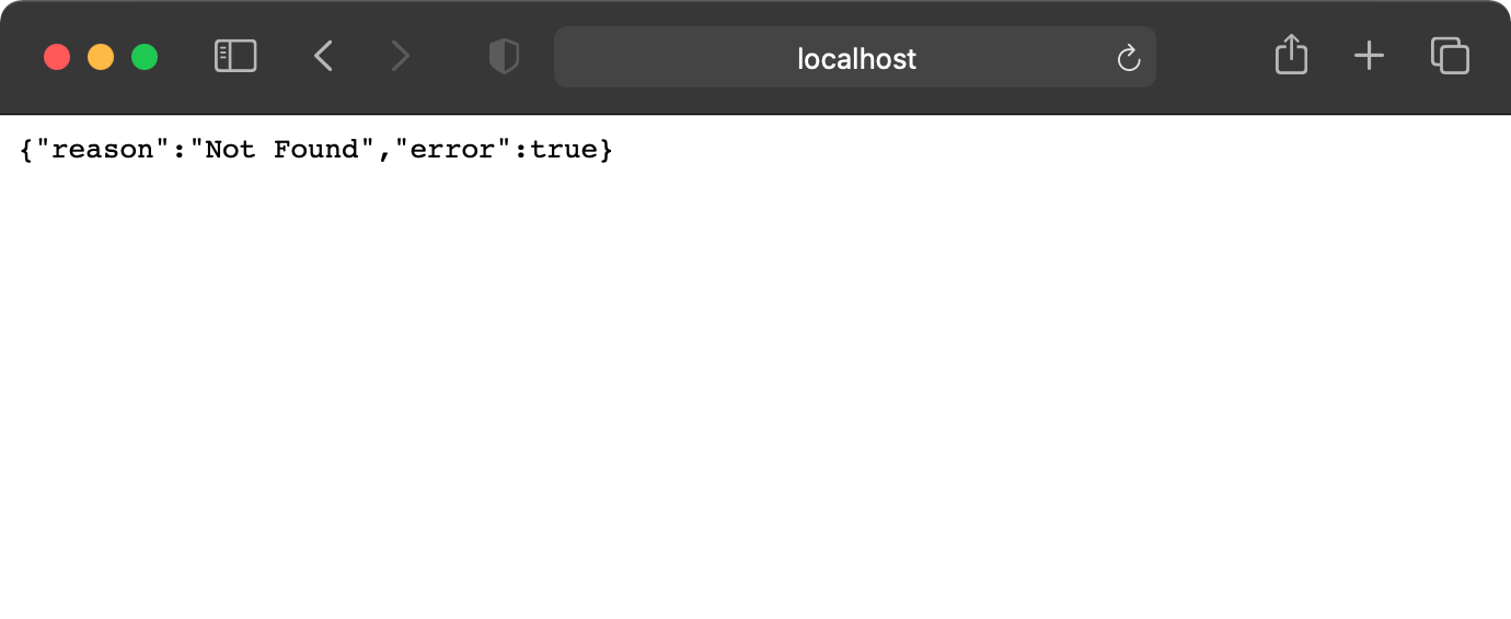
Expected error-response from Vapor
Go to /metrics. You’ll see two metrics reported: http_requests_total, a counter for HTTP requests, and http_requests_duration_seconds, a summary of request durations. The output in the browser should look something like this:
# TYPE http_requests_total counter
http_requests_total{status="404", path="vapor_route_undefined", method="undefined"} 6
# TYPE http_request_duration_seconds summary
http_request_duration_seconds{status="200", quantile="0.01", path="/metrics", method="GET"} 0.001937932
http_request_duration_seconds{status="200", quantile="0.05", path="/metrics", method="GET"} 0.002231176
http_request_duration_seconds{status="200", quantile="0.5", path="/metrics", method="GET"} 0.0030973375
http_request_duration_seconds{status="200", quantile="0.9", path="/metrics", method="GET"} 0.003550826
http_request_duration_seconds{status="200", quantile="0.95", path="/metrics", method="GET"} 0.0036431995
http_request_duration_seconds{status="200", quantile="0.99", path="/metrics", method="GET"} 0.003878795
http_request_duration_seconds{status="200", quantile="0.999", path="/metrics", method="GET"} 0.004442741
http_request_duration_seconds_count{status="200", path="/metrics", method="GET"} 1072
http_request_duration_seconds_sum{status="200", path="/metrics", method="GET"} 3.148946925
Bringing it All Together
Now, you’ll create a dashboard and start graphing these values. To start, stop your app in Xcode.
To set up a Prometheus and Grafana instance as well as run the Vapor app, you’ll use docker compose to run and orchestrate all this for you. Open Terminal and navigate to your projects directory using cd. In there, run docker-compose up --build. This will:
- Build and run your Vapor app.
- Set up a Prometheus server and start scraping your Vapor app.
- Set up a Grafana server and add Prometheus as a data source.
Trying Prometheus
You can find Prometheus at localhost:9090. Open the page, enter http_requests_total into the search field and hit Execute.
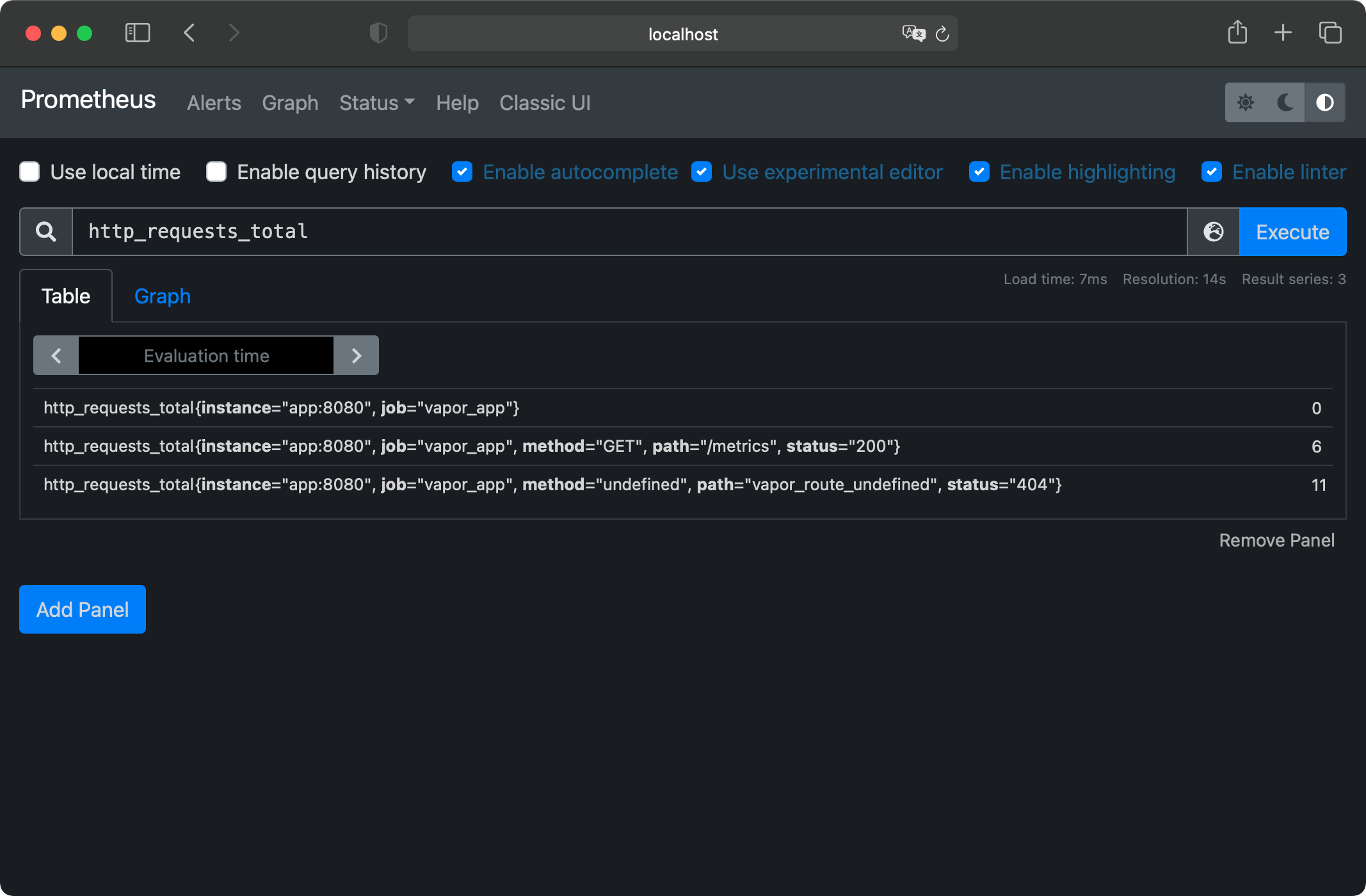
Prometheus query result as Table
This will show you the same stat lines you got from the /metrics endpoint, with two extra labels added to each line. instance and job. Prometheus adds these when scraping. instance contains the host and port of the instance originating the metric, which you can use to distinguish if you’re running multiple instances of the same app. job contains a name for your application you can configure for every scraped target. The job will be the same for all instances of an app.
Switch the tab below the search bar to Graph and you’ll see an ever-rising line for the requests to /metrics because Prometheus polls it every five seconds. You’ll find the configuration used to set up Prometheus and add the scrape targets in prometheus.yml. There’s also a target in there monitoring Prometheus itself, providing metrics on the underlying system.
Focusing on the Changes
The current query is nice, but it only shows the current number of requests — which will only ever go up. A more useful graph would show the ups and downs of requests per minute. Luckily, Prometheus has a function for this! Called increase, this function measures the increase (or decrease) in a metric over a certain time. You’ll also add a sum function around all this to account for possible multiple instances of an application running. The new query will look like this:
sum(increase(http_requests_total[2m])) / 2
Put the new query in the input field and hit execute, and you’ll see a flat graph at the number 12, as shown in the screenshot below. This magic number 12 comes from Prometheus scraping the metrics endpoint every 5 seconds, or 12 times a minute.
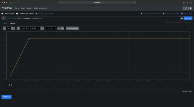
Prometheus graph example
If you start refreshing your API randomly and refresh the graph by re-executing the query, you’ll start to see ups and downs in the graph. Awesome!
Creating a Dashboard
Next, navigate your browser to localhost:3000, this is where Grafana lives. You’ll be prompted with a login page. The default credentials are admin as both username and password. Once logged in, you’ll see Grafana’s homepage. On the left side of the screen, hover over the + icon and select Dashboard from the dropdown.
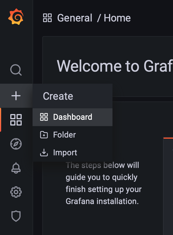
Grafana create Dashboard button
This will create a new dashboard with the first panel already added. Inside the panel, select Add an empty panel. This opens up the panel editor, which offers a few sections:
Grafana panel settings
- The biggest area is the panel preview. When creating a new panel, it will say “No data in response”.
- Below the panel preview is the query editor. This is where you can input one or more queries to show in the graph.
- The right bar contains options to customize the look and feel of your panel, relating to colors, legend, axes and graph styles.
Enter the same query used in the Prometheus dashboard into the query editor. You’ll see the same graph from the Prometheus dashboard in the panel preview.
Distinguishing by Status
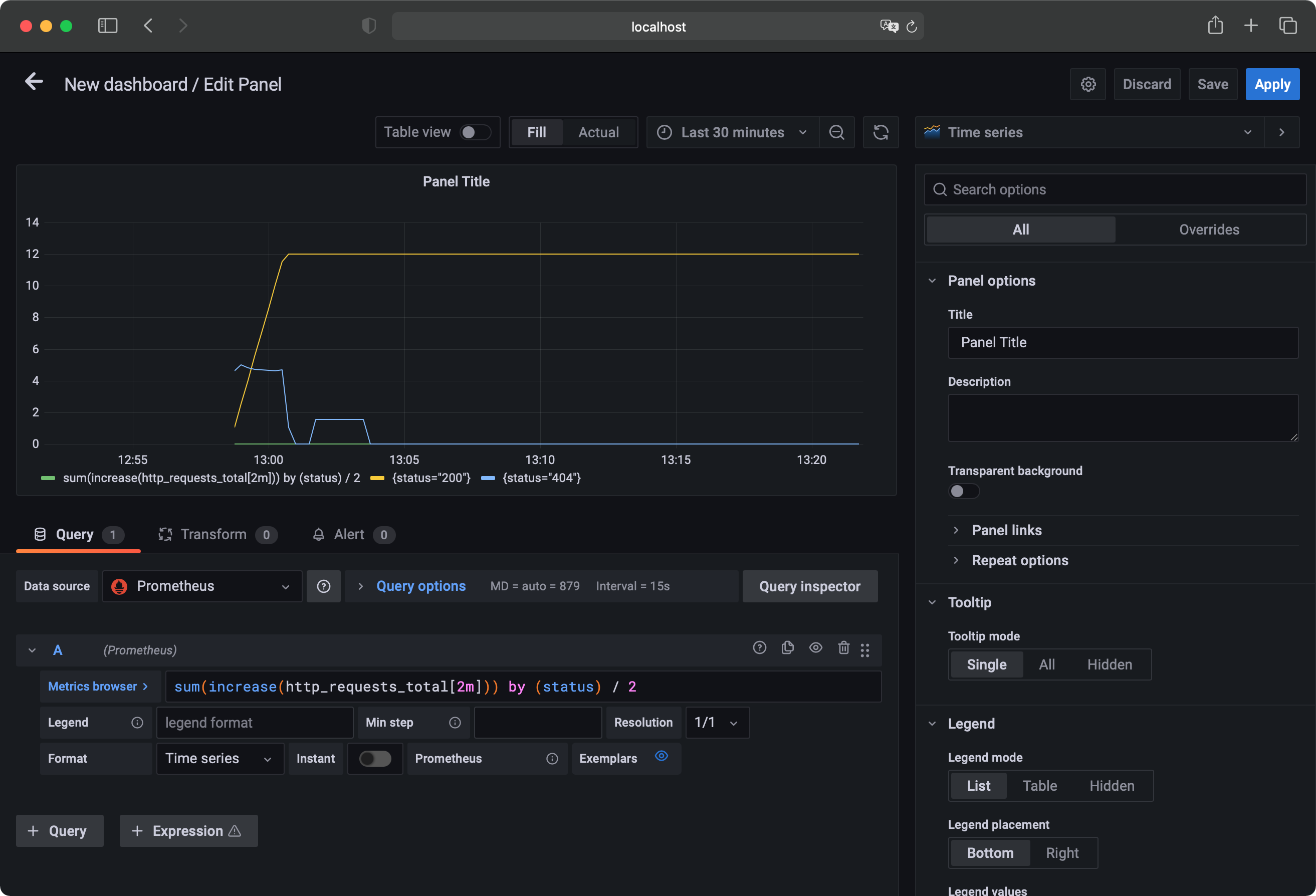
The current query returns the total HTTP Requests to your Vapor app. In most cases, it’s more useful to see requests grouped by status code, path or method. To do this, edit the query to the following:
sum(increase(http_requests_total[2m])) by (status) / 2
Adding the by clause to the query returns a separate dataset for every value of status Prometheus has observed.
Below the panel preview, you’ll now see a little legend with two colors and two labels. One of them is your query, and the other is {status="200"}. The first line consists of metrics without labels, which are not of interest in this case. To exclude them, add a filter to your PromQL query. Edit your query to the following:
sum(increase(http_requests_total{path!=""}[2m])) by (status) / 2
Anything inside the curly brackets is added as a filter to the query, in this case allowing metrics only where the path isn’t an empty string. It’s also a good practice to add a filter based on the job label added by Prometheus, so you see metrics of only the application you’re interested in. Your final query will look like this:
sum(increase(http_requests_total{job="vapor_app",path!=""}[2m])) by (status) / 2
Improving the Legend
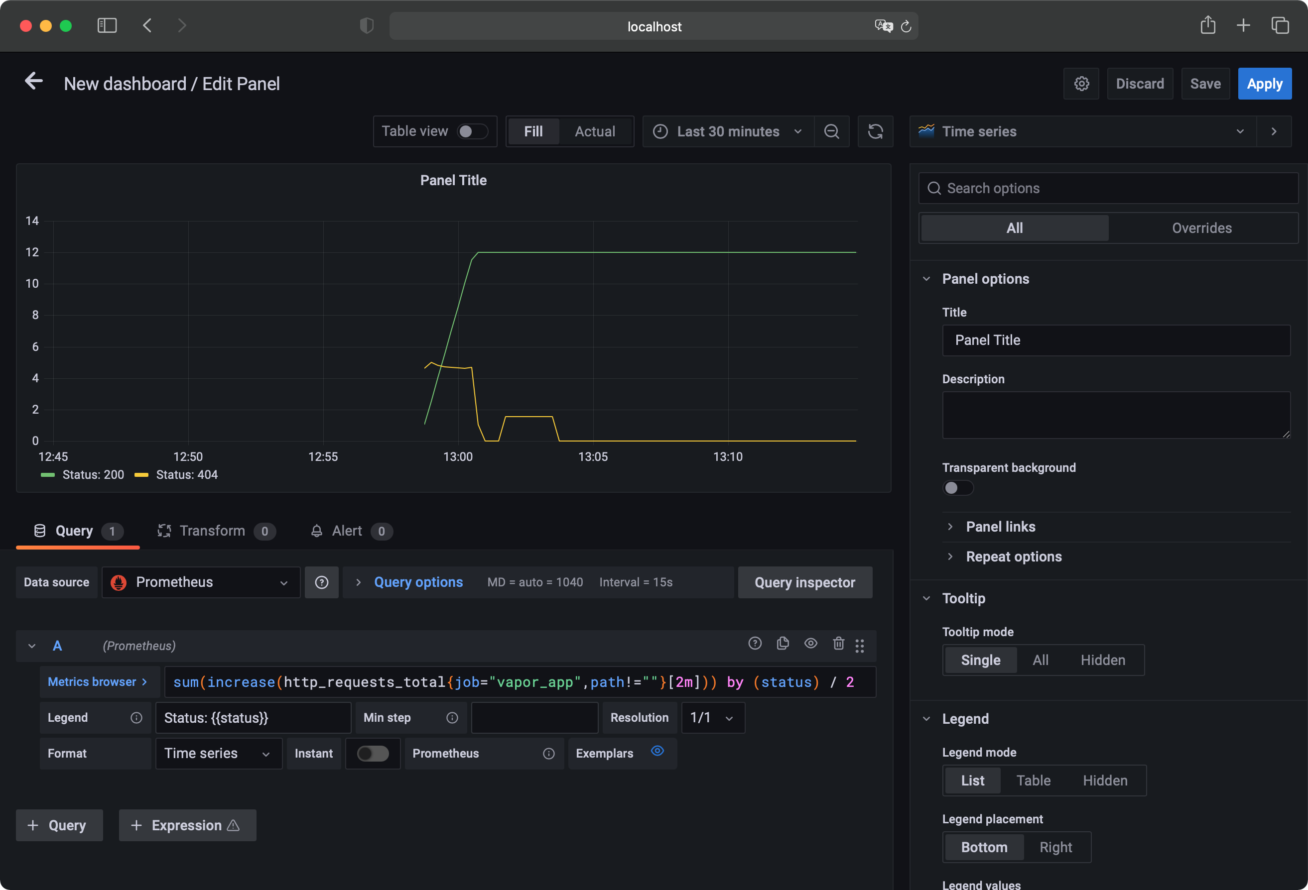
Looking at the legend below the panel preview, the graph is still named {status="200"}. Using the legend format field below the query field in the query editor, you can input a name format used by the legend. For this query, input: Status: {{status}}. Use label names surrounded by double curly brackets to template your query names. The label in the legend now shows Status: 200.
To make a new line appear, send a couple GET requests to your API homepage at localhost:8080. Wait a couple seconds and refresh the graph using the refresh icon at the top right of the panel preview area. A new line should appear, labeled Status: 404.
To get a closer look at your metrics, edit the time shown in the graph. This defaults to six hours. Using the dropdown to the left of the refresh button, select relative or absolute time ranges. For now, select Last 15 minutes as the relative time option.
Grafana panel settings
Finishing
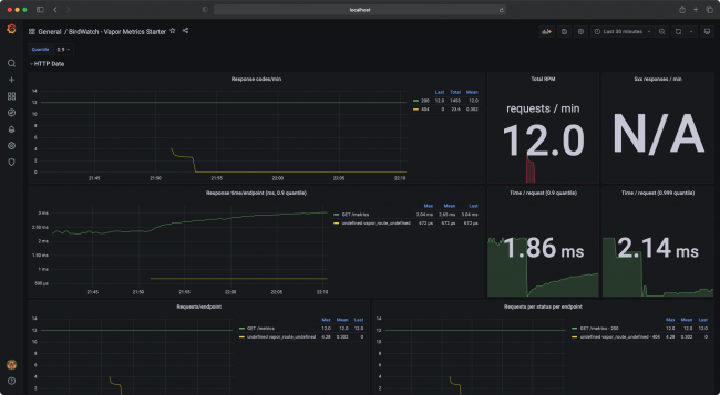
You just set up your first dashboard panel. As a finishing touch, you’ll add a bigger legend with some aggregated values and a panel title. To do this, find the Legend section in the right sidebar and select Table as legend mode. Also select Right for the placement option. In the Legend Values field, input Last, Total and Mean. Next, scroll to the top of the sidebar and enter Response codes/min in the Title field.
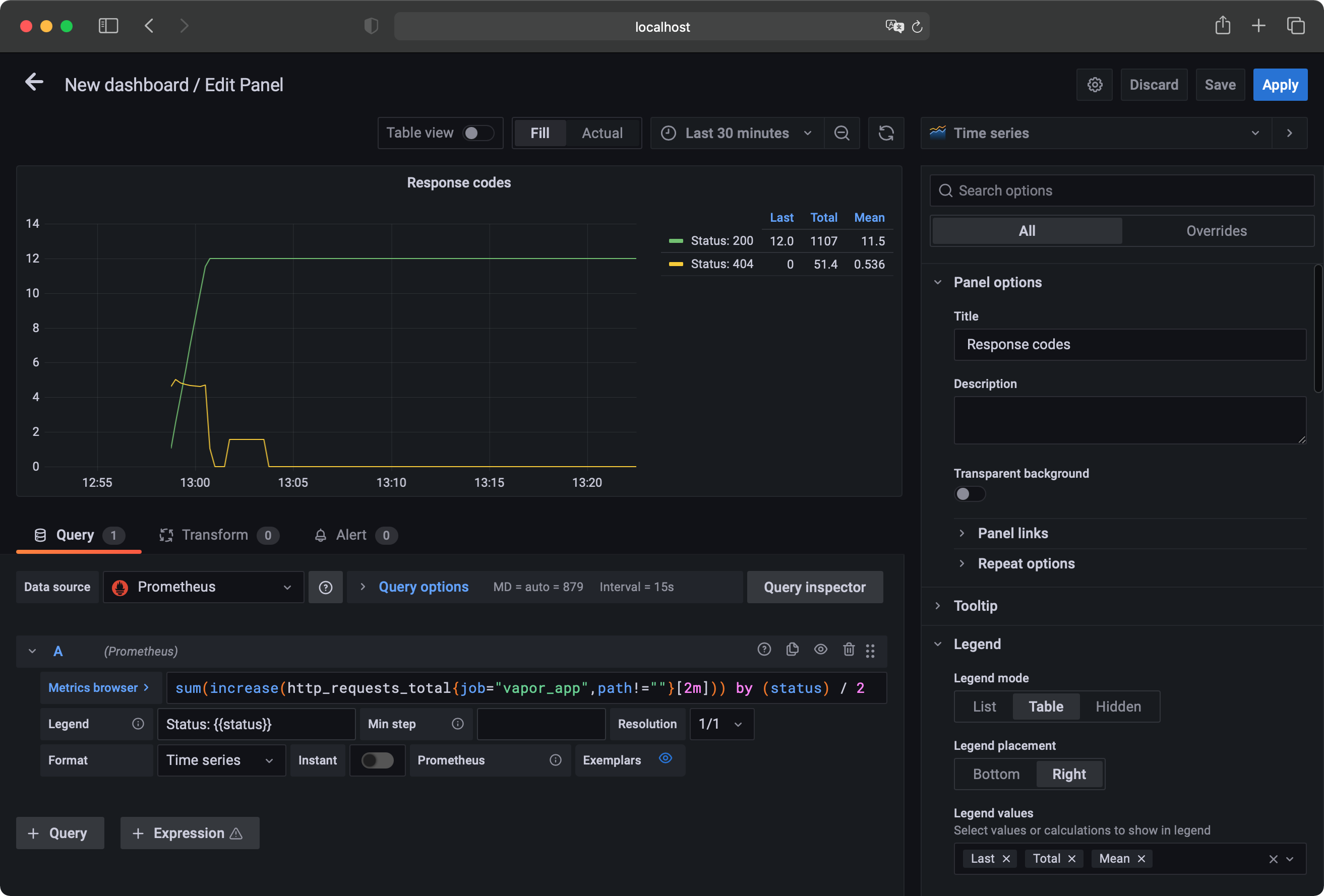
Grafana final panel settings
At the top-right corner of the window, click the Save button and enter a BirdWatch - My Vapor Metrics as your dashboard name. Click save again, and you’ll see your dashboard in all its glory! You can resize panels or add new ones using the add panel button at the top right of the screen. Take your time adding panels, playing around with all the options and building out a dashboard containing useful metrics like:
- Response times per endpoint.
- Requests per endpoint.
- Request statuses per endpoint.
Using the Predefined Dashboard
You also can create metrics! You’ll find a JSON file in the starter project called dashboard_starter.json. Use this as a template and import it into Grafana. To do this, hover over the + icon in the left sidebar and select Import. Here, you can upload the JSON file or paste its contents. When you’ve selected your file, click the Import button and voila!
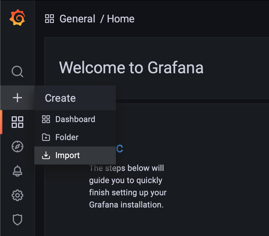
Import dashboard in Grafana
It’s a new dashboard you can edit and reuse for all your future Vapor apps.
The Grafana dashboard from the provided JSON file.
You’ve covered basic, out-of-the-box Vapor metrics. Next, you’ll learn how to add custom metrics in your application and use them in your dashboards.
Creating and Using Custom Metrics
The metrics Vapor provides out of the box are great, but they can never relate to your application’s specific use case and business logic. For this, use custom metrics.
Measuring Time
In Xcode, open BirdSightingController.swift. This is the app’s main controller with operations to register new bird sightings, get a list of sightings or retrieve information about a specific sighting. All these routes contain a database query, which you’ll time. Starting with the index route, replace the contents with:
return Timer.measure(label: "sighting_query_time_nanoseconds",
                     dimensions: [("op", "get_all")]) {
  return BirdSighting.query(on: req.db).all()
}
Here, your database query is wrapped in a Timer.measure call. Timer.measure is a utility API provided by Swift Metrics for timing blocks of code. You give it a label, which will be the metric’s name and a set of dimensions, that Prometheus will use as labels. Here, you record to a metric called sighting_query_time_nanoseconds, with a label of op="get_all". Record to the same metric at different points in your code, which you’ll do in the get method. Change its contents to the following:
let id = req.parameters.get("sightingID", as: UUID.self)

return Timer.measure(label: "sighting_query_time_nanoseconds",
                     dimensions: [("op", "get_single")]) {

  return BirdSighting.find(id, on: req.db).unwrap(or: Abort(.notFound))
}
Here, almost the same thing happens, writing to the same metric but using different labels.
Using a Counter
For the last method, create, you’ll add a similar timer as well as a counter. Replace the method contents with the following:
try BirdSighting.Body.validate(content: req)

let sighting = try req.content.decode(BirdSighting.Body.self)

Counter(label: "birds_spotted_total",
        dimensions: [
          ("bird", sighting.bird),
          ("section", "\(sighting.section)")
        ])
  .increment(by: sighting.amount ?? 1)

return Timer.measure(label: "sighting_query_time_nanoseconds",
                     dimensions: [("op", "save")]) {
  return sighting.save(on: req.db)
}
The Timer.measure is the same as before. What’s new this time is the Counter. It will add the number of birds spotted, dynamically labeled based on the type of bird, as well as the section of the park where the birds were seen. This will allow for some pretty cool dashboard panels!
Make sure to save these changes in Xcode by pressing cmd-s or Menu-Bar > Save.
Then, go to the Terminal window running docker-compose and restart and rebuild it by pressing ctrl-c and typing docker-compose up --build.
When that’s done, make sure you’ve implemented the changes correctly by navigating to /sightings. This will return an empty array [] and produce some metrics, prefixed with sighting_query_time at /metrics.
Updating Your Dashboards With Custom Metrics
Now that the metrics are in place, it’s time to add new panels to your dashboard. Back in your Grafana dashboard, start adding a new panel by clicking the Add panel button in the top bar. When the menu opens, select Add a new row instead of Add an empty panel. Use rows to group panels and collapse sets of panels.
new row in Grafana
Hovering over the row title will make a cog icon appear. Click it to open the row options, where you can input a title. Name the row Bird Data. Now, start adding a panel and select Add an empty panel. This panel will show the number of birds per section of the national park and use a different panel type. At the top right of the screen, click the Time series dropdown and, instead, select Pie chart. The query for this panel will be quite simple and like ones you’ve used before:
sum(birds_spotted_total{job="vapor_app",bird!=""}) by (section)
Input the query into the query editor and set the Legend format to Section {{section}}.
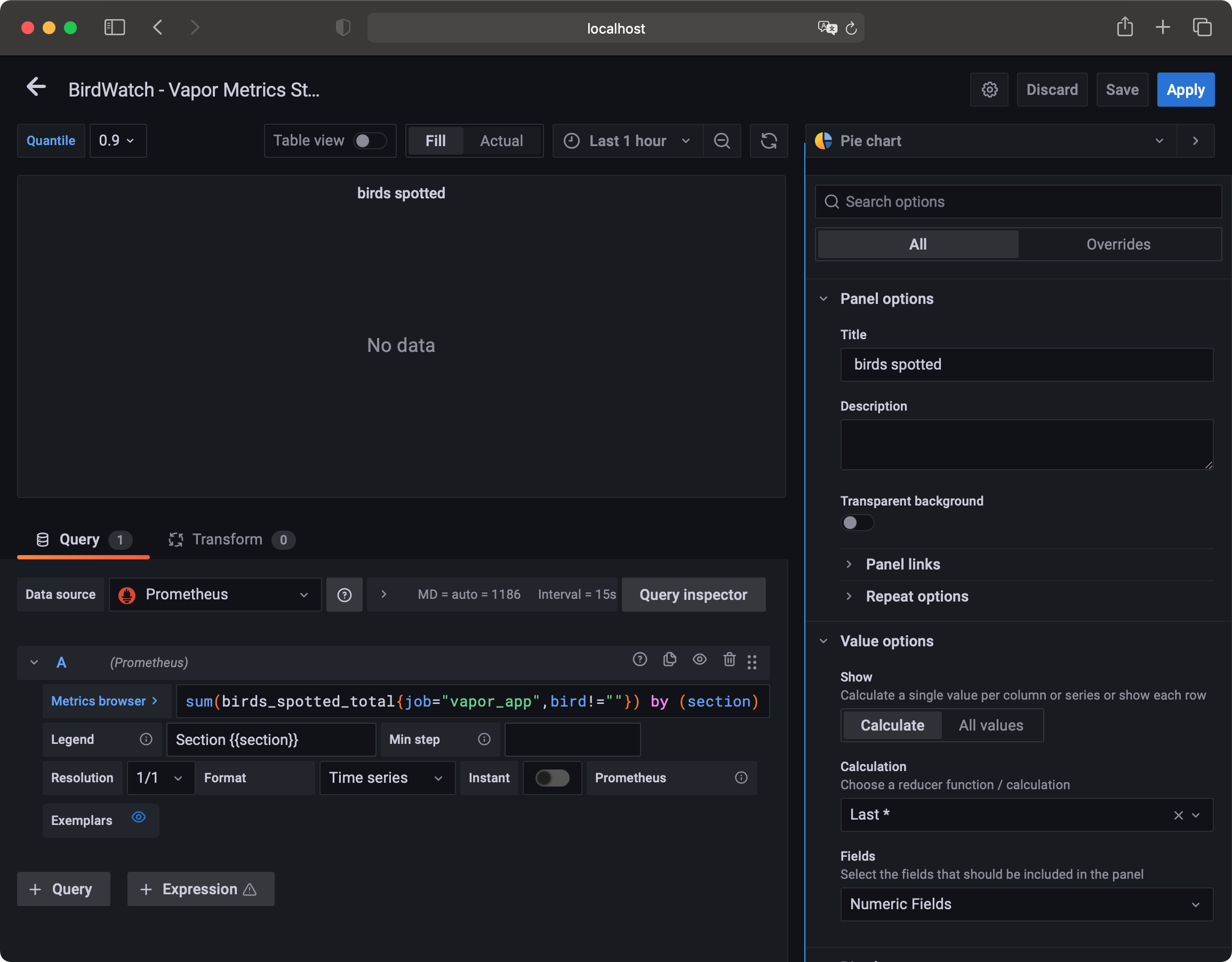
Panel Settings for Pie chart
Adding Data
There might not be data yet, but that’s an easy fix. You can register a new bird sighting by using the following cURL command in Terminal:
curl --location --request POST 'http://localhost:8080/sightings' \
--header 'Content-Type: application/json' \
--data-raw '{
    "bird": "Swift",
    "section": 1
}'
Execute the command a couple of times, changing the section between 1, 2, 3 and 4. To register multiple birds seen at once, add an optional amount field to the JSON body.
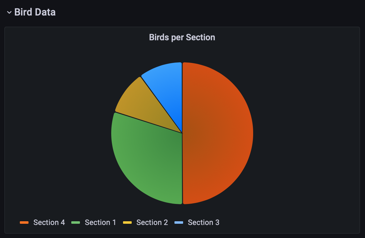
Pie chart panel in Grafana
Now, refresh your dashboard and your pie chart should appear. Excellent! To wrap up this panel, set the panel title to Birds per section, add the legend as a right-side table and add Value as a legend value. Under the Pie Chart section in the sidebar, also add Value into the Labels field. Save your dashboard and exit the panel editor by clicking Apply in the top-right corner.
Charting by Breed
Along with the number of birds per section, add a chart showing the number of birds per breed across the entire park. Because this panel will be mostly like the one you just created, hover over its title, click the downward arrow and select More… -> Duplicate. You’ll now see your “Birds per Section” panel show up twice. Using the same dropdown menu, go to edit the duplicated panel. Once in edit mode, change the grouping of the query from section to bird and update the legend format to {{bird}}. Next, update the panel title to Total birds per breed and change the pie chart label from Value to Percent to show the share of each bird.
Don’t forget to save and apply your changes! To wrap up the dashboard, add two more panels: one showing the trend of bird spots over time and another showing the average time taken by the database queries.
The first panel will be like the ones used for the HTTP metrics section. Create a panel, with the following query:
sum(increase(birds_spotted_total{job="vapor_app",bird!=""}[2m])) by (section, bird) / 2
Set the legend format to {{bird}} - Section {{section}} and add a table legend to the right side of the graph, with Mean added as legend value. Set the panel title to Bird spots over time and save your changes.
Visualizing DB Query Duration
Return to your dashboard and add the final panel. This panel will use the avg function to display average time taken by database queries. Input the following query:
avg(sighting_query_time_nanoseconds{quantile="$quantile",job="vapor_app",op!=""}) by (op)
Here, you’ll also see the new quantile label that’s filtered on. If you look at the code added before, you only added the op label, so where does this quantile come from? Swift Prometheus adds quantiles automatically, and Prometheus uses them to bucket results. For example, using the 0.5 quantile would show you the median value, suppressing any outliers.
Using Dashboard Variables
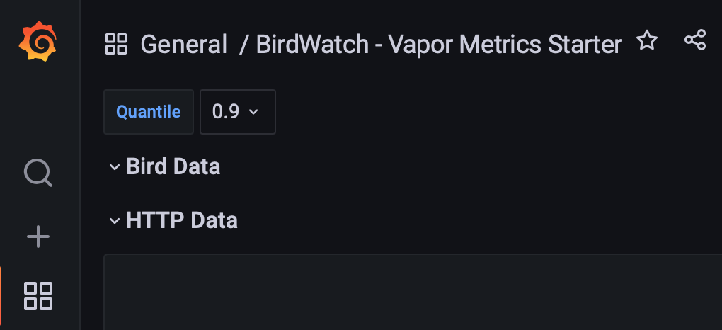
In the query, instead of passing a value between 0 and 1 as the quantile, $quantile is used. This is a dashboard variable. You can configure variable by going into the dashboard settings, using the cog icon at the top right and selecting Variables in the left menu. If you’re extending on the starter dashboard, the quantile variable already exists. If not, you can add a variable named quantile, of type Custom, label Quantile and value 0.01,0.05,0.5,0.9,0.95,0.99,0.999.
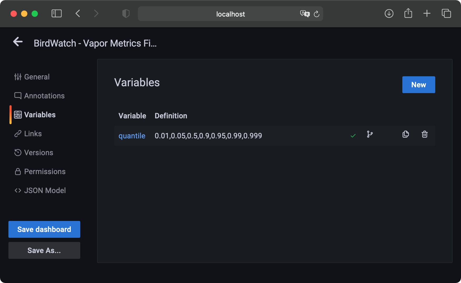
Configure the Variables in Grafana
After saving your variable and returning to editing your panel, you’ll see a Quantile dropdown at the top left. Using the dropdown, select the 0.9 option, making your dashboard show only the middle 90 percent of data, excluding the top and bottom 5 percent outliers. Feel free to select different quantiles and see how they change your timing graphs.
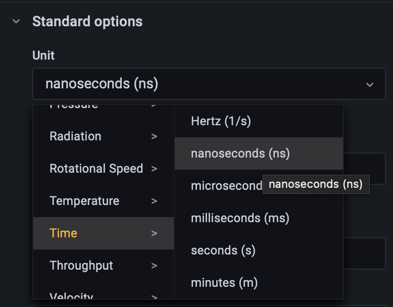
Changing the Unit
As the metric name suggests, the query time is reported in nanoseconds. By default, Grafana will assume metrics are in seconds, making your values show up as millions of times too big. To fix this, find the Standard options section in the sidebar and, in the Unit field, select Time -> nanoseconds (ns). Now, Grafana will correctly interpret the values and your legend will automatically change to use ns, ms or full seconds when and where appropriate.
Configure the Unit of the values
Configuring the Legend
To finish the panel, set the legend format to Operation: {{op}}, add a legend table to the right containing the Mean and Min values and name the panel Average query timings. Save and apply your changes, and return to your main dashboard. Resize and drag around your panels however you’d like. Drag all panels you just created into the Bird Data row so they can easily be collapsed.
Importing Prebuilt Dashboard
The final dashboard containing the graphs created in this tutorial, as well as extra graphs created using the same principles, can be imported from dashboard_final.json in the starter project. Feel free to open it and play around with the panels to find out about all the excellent options Grafana has available.
Where to Go From Here?
You can download the final project, including the starter and final dashboard using the Download Materials button at the top or bottom of this page.
To learn more about Grafana and its panel types, check out the Grafana Docs. Prometheus also offers more types of metrics this tutorial did not cover. Find out about those in the Prometheus Docs.
Swift Metrics supports all the metric types Prometheus has. Learn more about them in their API Docs. Swift Metrics and Swift Prometheus are both open-source and can be found on GitHub.
If you have any comments or questions, please join the forum below!
raywenderlich.com Weekly
The raywenderlich.com newsletter is the easiest way to stay up-to-date on everything you need to know as a mobile developer.
Get a weekly digest of our tutorials and courses, and receive a free in-depth email course as a bonus!
Recommend
About Joyk
Aggregate valuable and interesting links.
Joyk means Joy of geeK