

How to create large component sets in Figma
source link: https://uxdesign.cc/how-to-complex-components-in-figma-69ff2021aaaa
Go to the source link to view the article. You can view the picture content, updated content and better typesetting reading experience. If the link is broken, please click the button below to view the snapshot at that time.
How to create large component sets in Figma
Creating and maintaining design systems is an incredibly interesting work. It allows you to combine and develop both the skills of a designer and an engineer. It is also an opportunity to be a designer/developer to create products for other designers/developers that will define the style and nature of their work in many ways.
However, many people are often intimidated by the amount of work it can take to create something seemingly simple, such as an input component. Especially if you’re a designer and you need to draw all the possible combinations manually.
In this article, I will try to show how to create complex components in Figma with the help of certain methods and techniques (and how not to go crazy in the process 😅). From my perspective, a table is a very good example of such a component.
Tables in Figma
In Figma, there are no built-in tools for creating tables. You have to create them manually with text, lines, rectangles and other basic elements. You can, of course, use some table generator plugins, but if you want a specific design, this method might not help.
The Figma community uses many different methods to create tables. However, when flexibility is needed, most often tables are created based on component cells, which are then assembled into columns (or rows) and then used to form tables.
Initial template
Usually, before you create any component, you need a mock that clearly defines all the indents, colors, and other properties. In the case of tables, this is the style of headers, separators, indents, and more. But you don’t necessarily need all the possible content variants at once. With the right component structure, you can do this later.
Let’s say we have two tables types:
- with line-separators
- “zebra”

And we need to use rows of different heights.

In addition, based on the existing cases, we need to support several types of content:
- simple text line
- text with secondary line
- text with start icon
- button
- checkbox
- loading (a skeleton view for the table)
The initial template doesn’t have to be perfect in terms of internal layout. It could very well be that your initial draft will consist of all sorts of “Rectangle 1”, “Frame 4”, “Text 2” and other elements that are just grouped together. We need the template primarily to show the visual style of the future component.
However, if you want to make a component based on such a template, you’ll need to answer some important questions:
- How the component will be called?
- How will each element, layer or group be organized and named in the hierarchy?
- Which properties should be configurable and which should always be constant?
- Do some parts need to be modularized for reuse elsewhere or to provide variants?
Basically we need to define the anatomy of our component. Some call this description an API draft, because it often defines the future structure of the component in the code and is ideally defined together with the developers.
In my opinion this is the most important stage.
Component anatomy
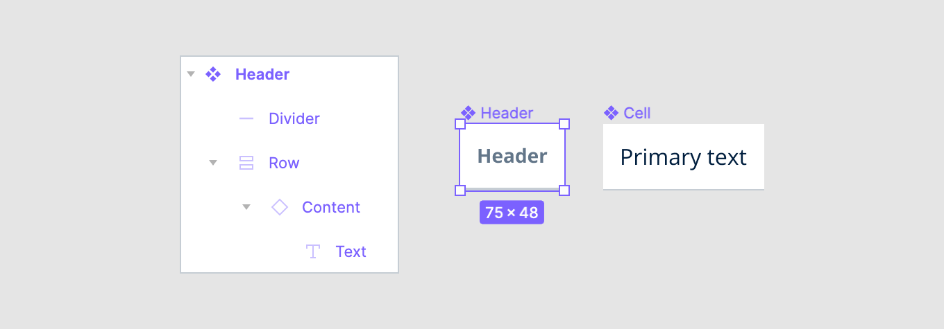
I’ll start with the main element of the table, the cell. In the original templates, the most basic version of content is a single line of text. However, since I will need to support other types of content as well, I will separate the content into a separate “Content” block. It will only be responsible for content and internal paddings (e.g. in the case of icon and text). This will allow me to further extract it into a separate module and create a sub-component that will manage different types of content.
For clarity, I will right away create a component “Cell” for the cell and will gradually refine its structure. This will allow me to test its behavior in different sizes and different types of content in the process of working on the component.

Since all cells must have certain horizontal spacings, it is better to define them globally, so that you can set them for all cells at once if necessary. To do this, I need an additional container “Cell spacing”.

Next, I need to add separators and define the background. In the case of a zebra table, it will be enough to change the color of the entire cell. In the case of line separators, they will need to be added to the component structure:

The overall structure is ready. Now I can extract the “Content” block into a separate component set, where I will combine all possible types of content I need.
Since this component set will be used inside the cell only I will isolate it by adding the prefix “_” (or “.”):

All that remains is to set the paddings, alignments within the cell, choose colors for the background and dividers, and set the default cell height. In my case, it is 48px.
At this stage, it is advisable to set all colors based on styles right away (I personally prefer to use semantic colors). The same goes for setting up the typography. This will greatly simplify both further work on the component.
Header
The header can be made based on the cell component. I just need to make a copy of the “Cell” component, name it differently (“Header”, for example) and make the necessary changes. In my case, the text style will be different and the divider will be a bit bigger.
Column layout
For simplicity, you can create a component set (a component with variants) based on the basic “Cell” component that allows you to select the type of content, row height, and other options. However, in this case, the designers would have to manually combine cells into columns and then into tables each time. We can make life a little easier for them and create special components for columns.
To get started, I’ll use Auto layout to assemble a simple table column by combining several instances of “Cell” and one “Header”. At this point, I need to create a column with as many rows as I might need for design. Let’s say 8 (I rarely use more in my projects). If you need more, add as many as you need. However, it’s important to compromise here, as more rows can increase the number of variants you will need to create.
So that the columns can be further resized, for each cell and header within the Auto layout I will set the horizontal resizing to Fill container.

Now I need to rename all the even cells to “Even cell”. This is to make it easier to select them for the zebra-style columns.
I will create a copy of the column and select all “Even cell” cells in it.
In this particular case, I have not many cells and, basically, I could just select all “Even cell” cells manually. However, since further working on the component I will need to do this in a more complex objects, let’s just figure out how to do it automatically.
I will use a wonderful plugin Find in page.

After installing the plugin, it takes a few simple steps to select all items by name:
- Select the copy of the column I created.
- Run the plugin.
- Specify the settings:
- Phrase to look for: Even cell
- Search in: Selection
- Match whole word: On
- Search for: Layers
In this example the design is simple, with few layers, so the search is quick and the plugin will select all the “Even cell” layers, i.e. it will select all the even numbered instances of a cell. All I have to do after is change the background color to whatever I want the even numbered rows to use based on my original template.
I will repeat the procedure for the same column and now use the plugin to select all the dividers in the cells. They are called “Divider” and I need to hide them, as they are not needed for zebra tables:
- By selecting Object > Show/Hide Selection in the menu.
- Or by using hotkey ⌘ + Shift + H.
Because this will also make the header separator disappear (which I don’t need), I need to bring it back. Since it is only one cell, I will “unhide” it manually.

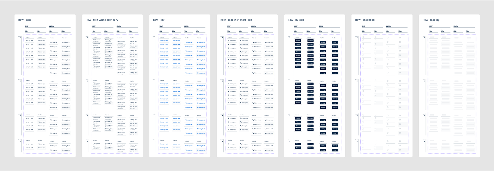
Variants for different number of rows
In the previous step, I created a column with the maximum (required for me) number of rows for both tables types. Now I need to create variants of those columns with different numbers of rows. As a compromise for simplicity, I will create variants only for the even steps: 2, 4, 6 (I already have for the “8”).
I need to make copies of my columns (3 for each table) and remove the extra rows to get a column with 6 rows, 4, 2.

Variant grid
The technique of working with variants in Figma is ingeniously simple: for each combination of properties, you need to create a separate variant and then combine them all into a component set.
For clarity, when you create each variant, you can immediately explain (by adding a caption legend) what it does.
In the previous step, I already created all the necessary variations of the number of rows. Now I need to arrange them all together so that it’s convenient to add variations for other properties later.
I will place all the variations in the form of a grid:
- Horizontally in a stack the columns by different table “types” with the same number of rows.
- Vertically, variations by number of rows.
In addition, I will add a caption legend for each line/stack to help better understand the setup.

Variants for different row heights
Now I need to create variants for different row heights. I originally had the cells at 48px in height. I’m going to add another variant for 56px.
To do this:
- I’ll create a copy of all the variants I created earlier on the right.
- Select all the new copies.
- Press “Enter” (in Figma, this allows me to go one level inside the layer and select all the layers inside): all the cells in each selected variant will be selected.
- Specify 56px in the height parameters.
All that remains is to add a caption legend for the variants.
- “Small” — the original variant at 48px.
- “Medium” — the new one at 56px.

Naming variants
Since I already have a full set of variants, it is possible, in theory, to compose a set of components right away. However, it’s better to give the right names to each variant before doing so. This will speed up the process considerably.
To start, I need to list all the properties for the variants. In my case these are:
- Rows: number of rows.
- Type: table type (zebra and line-separators).
- Row size: row height.
On the basis of these properties I need to form a template for the name of the variant:
Rows / Type / Row size
Now all variants should be renamed:
- Select all variants.
- Press a hotkey ⌘ + R.
- Set a new name “Rows / Type / Row size” for all selected objects.
- Press “Rename”.

Now, using the template, I can set the desired name for each variant. Since all variants are built in a grid/table for simplicity I will name the groups of variants by the lines corresponding to the caption legend on the left or top of the variants.
I’ll start with the “Rows”:
- Highlight all the variants in the row “Rows” with a value of 8.

2. Rename the selected variants by replacing the word “Rows” with 8.

3. Repeat for all the other variants in the other “Rows” lines, replacing the word “Rows” with its corresponding value.

Next I need to work on the variants lines according to the “Type” property in a similar way:
- Select all the variants in the “Type” line with the value “Lines”. There are two of them, one for each size.

2. Rename all the selected variants, replacing the word “Type” with “Lines”.
3. Repeat for the remaining variants “Type” with the value “Zebra”, replacing in them the word “Type” with “Zebra”.
Then it remains to set the correct names for the variants according to the values of “Row size”.
- Highlight all the variants in the “Row size” line with the value “Small”. There are two of them.

2. Rename all the selected variants by replacing the word “Row size” with “Small”.
3. Repeat for the rest of the variants for “Row size” line with the value “Medium”, replacing the word “Row size” with “Medium” in them.
Done. Now I can assemble the component set.
Creating and configuring a component set
In order to create a component set, I need to select all the created variants and select Create Component Set in the panel above.

Let’s call the new component “Row — text”. Since in the previous step I named each variant according to its properties, all of them were transferred to the parameters of the new component set. The only thing is that for now the properties have basic names: “Property 1”, “Property 2” and “Property 3”. I just need to adjust these names and maybe sort the options for them:

That’s it, the first component set is ready. I’ll frame the first set right away for easy organisation in the library.

Creating new component sets based on the first one
The first set is made for the simplest type of content — a string of text. For many cases, this could be enough, but it’s better to prepare similar sets for all other types of content:
- text with secondary
- text with start icon
- button
- checkbox
- loading
I will make a copy of the first set and call it “Row — text with secondary”. This is the next component in my list. Now it remains to change the content in each variant.
The content of each cell in our example is specified by the “Content” sub-component, which has different content variants. However, how do I select this module in all cells at once? After all, I have 16 variants in the grid with multiple rows of cells in each.
I could use again the Find in page plugin to select the “Content” block in each cell. However, in this particular case it is not suitable, because also all the headers in the table have the same module and I don’t want to change them for this type of content.
I will use the built-in Figma features — select the elements I need by color.
- I need to start by selecting the new component set.
- Then in the Selection colors panel, I need to select the color of the text inside the cells. I used semantic colors when designing the table, so I will choose “text/primary”. In this case, the text in the header will not be selected, because it is using a different color — “text/secondary”.

If you don’t use semantic colors and you have them represented by the abstract tokens like “Grey100”, “Blue-1”, etc. so that the same color is used by some other part of the cell, you can temporarily “paint” the text at the “Text” variant in the “_Cell content” sub-component into something unique and select it then in a new component set.
3. Now that I have selected the text in all cells, I need to select the layer in which it is located (the “Content” layer-module). To do this, I can use the Shift + Return hotkey (in Figma, this allows to moves up in the layer hierarchy (as opposed to Return which moves down/in)), so, the “Content” layer-module will be selected in all cells.

4. In the settings of the block-module “Content” now I need to select the variant “Text with secondary”.

The set is ready.
Now in the same way I need to create sets for
- text with start icon
- button
For the remaining 2 content types, I will use a different method.
- I’ll create 2 copies of the first set and call them “Row — checkbox” and “Row — loading”.
- For each, separately, using the plugin Find in page I will select the layer-module “Content”.
- In the settings of the “Content” module I’ll specify the appropriate variant: “Checkbox” for “Row — checkbox” and “Loading” for “Row — loading”.
That is it. Done.
You can check the result in this Figma-file.
Conclusion
The techniques described in this article might help you not only to work on tables or other components, but also to work with any complex objects in Figma.
Recommend
About Joyk
Aggregate valuable and interesting links.
Joyk means Joy of geeK