
1

改进文档可读性的三个步骤
source link: https://www.lujun9972.win/blog/2018/12/18/%E6%94%B9%E8%BF%9B%E6%96%87%E6%A1%A3%E5%8F%AF%E8%AF%BB%E6%80%A7%E7%9A%84%E4%B8%89%E4%B8%AA%E6%AD%A5%E9%AA%A4/index.html
Go to the source link to view the article. You can view the picture content, updated content and better typesetting reading experience. If the link is broken, please click the button below to view the snapshot at that time.
改进文档可读性的三个步骤
今天看到一片不错的文章:Typography tips for a more comfortable read. 该文演示了如何通过三个步骤的調整让一篇难以阅读的文档变得结构清楚,容易阅读。
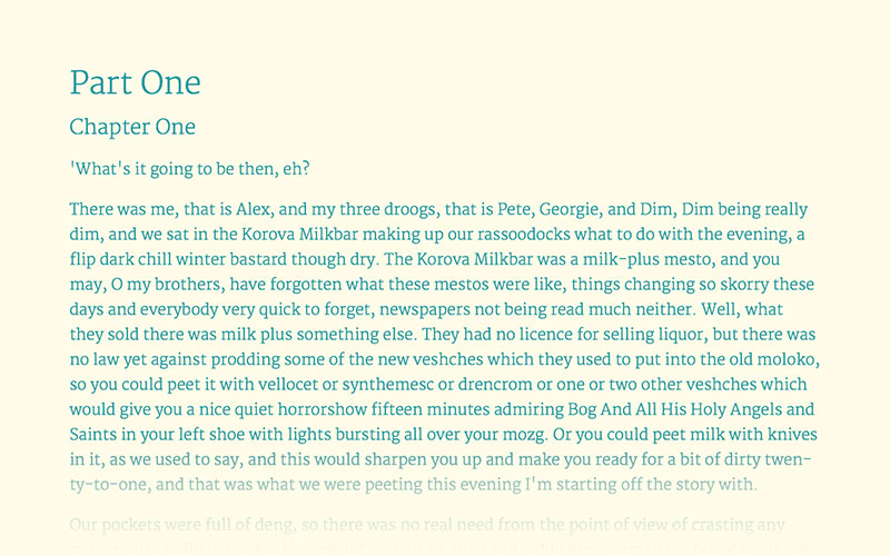
下面是原始文档的原始布局
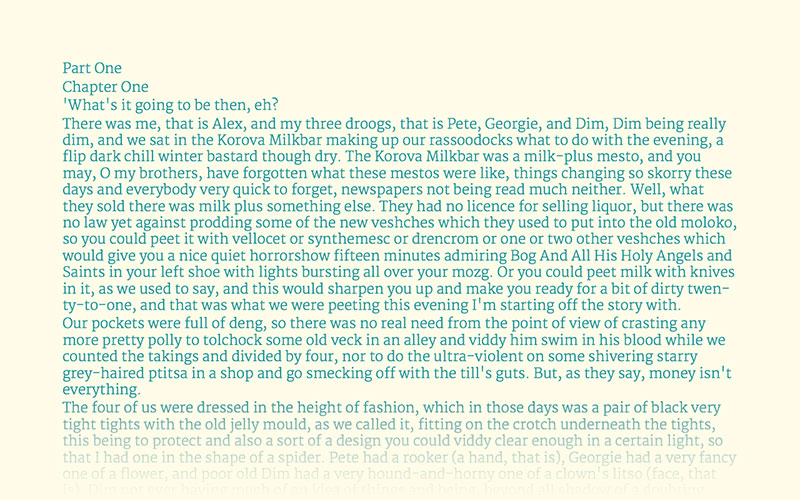 你可以看到原始文档的布局,所有内容挤在一起,很难看.
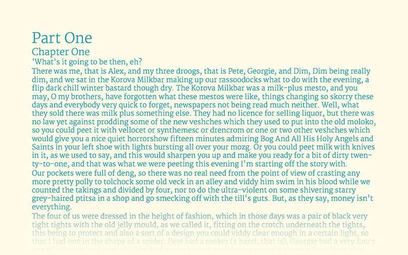
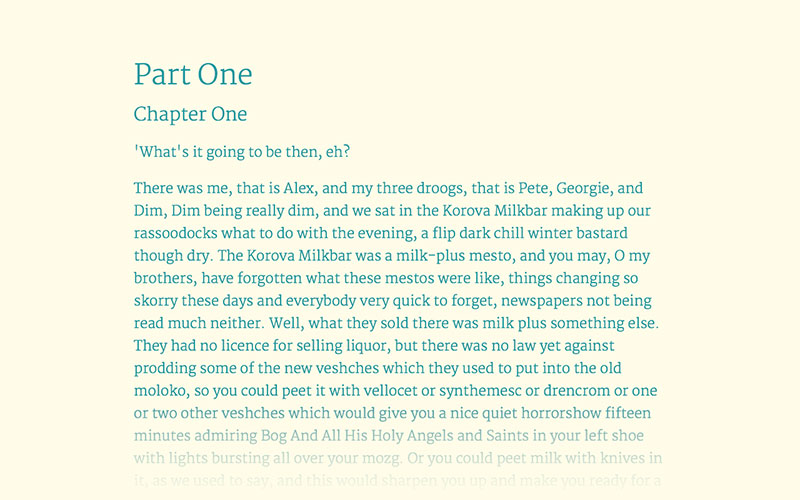
为不同级别的标题和正文设置不同的字体大小
通过为不同级别的标题和征文设置不同大小的字体可以清晰文档结构。
所有的字体都以正文字体大小为基准进行调整,比如正文字体设置为22pt则:
- 一级标题设置为正文大小的
180%-200%,即40-44pt - 二级标题设置为正文大小的
130%-150%,即29-33pt - 三级标题设置为正文大小的
100%-125%,即22-28pt - 说明性的文字设置为正文大小的
70%-75%,即15-17pt
设置后,文档布局变成了这样:
设置段落间距和行间距
关于段落间距和行间距的定义可以参见下图:
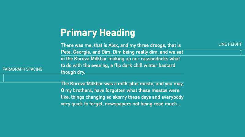
大多数的情况下,段落间距等于正文字体,即设置段落间距为22pt
行间距一般设置为正文字体的 120%-160%,且正文字体越小,行间距设置越大。
太长的行难以阅读,理想情况下,一行包含的字符为 65-75 个。
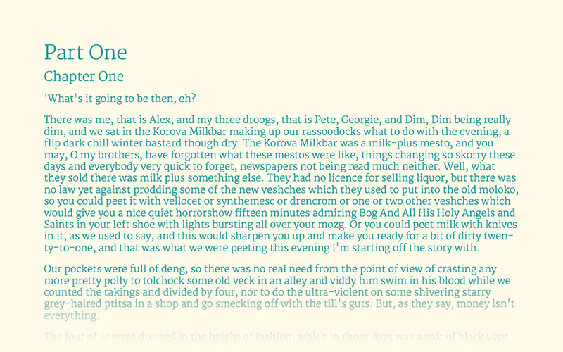
调整过程演示
下面这幅动态图片演示了每次调整所发生的改变:

Recommend
About Joyk
Aggregate valuable and interesting links.
Joyk means Joy of geeK