

Simple sparkline chart with MPAndroidChart
source link: https://www.rockandnull.com/mpandroidchart-line-chart-example/
Go to the source link to view the article. You can view the picture content, updated content and better typesetting reading experience. If the link is broken, please click the button below to view the snapshot at that time.
If your app has anything to do with numbers there's a big chance that at some point you will need to visualize those numbers with a chart. There are many libraries for Android out there. But most of them are either not maintained anymore or don't have enough activity to inspire confidence about their future.
I think the most popular open-source charting library for Android is MPAndroidChart . With 31k+ stars in GitHub and quite a few questions in StackOverflow, I think it will be around for the foreseeable future. The popularity is probably due to the variety of supported chart types (line chart, bar chart, pie chart, you name it) and to the excellent (but kind of long) documentation.
There are a few other promising libraries (e.g. Spark ) but I decided to go with the flow and stick to the popular and tested choice. In this post, I will explore how to make a simple sparkline chart using MPAndroidChart. Think of it as a quick start for the library.
Setup
You would need to add a new repository in your project-level build.gradle
.
repositories {
    maven { url 'https://jitpack.io' }
}
Then add the actual dependency in your module-level build.gradle
(check out the project site for the latest version
).
dependencies {
    implementation 'com.github.PhilJay:MPAndroidChart:v3.1.0'
}
Viewport
After syncing, you can refer to the MPAndroidChart view in your XML.
<com.github.mikephil.charting.charts.LineChart
    android:id="@+id/chartView"
    android:layout_width="match_parent"
    android:layout_height="match_parent"
    android:layout_margin="16dp" />
This will be the viewport where the chart will be drawn.
Customize viewport
For creating a sparkline, we need to customize the viewport by changing some of the default settings.
with(chartView) {
    // (1)
    axisLeft.isEnabled = false
    axisRight.isEnabled = false
    xAxis.isEnabled = false
    legend.isEnabled = false
    description.isEnabled = false

    // (2)
    setTouchEnabled(true)
    isDragEnabled = true
    setScaleEnabled(false)
    setPinchZoom(false)
}
In (1)
we hide all the axis, hide the description and the legend. Necessary for every sparkline.
(Optional) In (2)
we enable drag but disable all scaling, pinching, and zooming. This is needed for showing a small label when a data point in the chart is selected. The dragging is needed for allowing the selection to be changed dynamically while the finger is moving.
Dataset
The library has an Entry
data type that represents a single data point in the graph. You need to convert from whatever format you hold your data, into a List<Entry>
, with each entry defining an X and Y (as Float
).
val entries =
    myData.map {
        Entry(
            it.timestamp.toFloat(),
            it.value.toFloat()
        )
    }
Customize dataset
Similarly to how we customized the viewport, you can customize the dataset. Whatever you want to change in the line itself (e.g. color, width) is defined here.
val dataSet = LineDataSet(entries, "Unused label")
    it.color = Color.BLACK
    it.valueTextColor = Color.GRAY
    it.highLightColor = Color.RED
    it.setDrawValues(false)
    it.lineWidth = 1.5f
    it.isHighlightEnabled = true
    it.setDrawHighlightIndicators(false)
}
This is a sample config that sets different colors for different states, make the line thicker, and disables highlight indicators (orthogonal lines that meet at the highlighted point).
Render
Finally, set the dataset in the chart and call invalidate()
. Every time you change the chart data, you would need to call this for the chart to refresh.
chartView.data = LineData(dataSet)
chartView.invalidate()
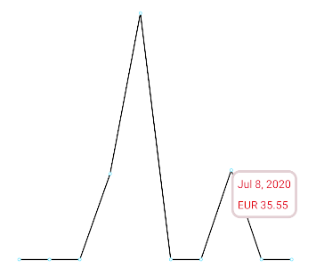
(Optional) Marker
A marker is a small "popup" view that appears when a user clicks on a data point on the graph. This is useful, especially in a sparkline with no axis and labels, to show the exact value of the data point.
The library provides all you need for this functionality. You only need to extend MarkerView
to provide a layout file for your marker (i.e. the "popup" view) and the logic for updating the values.
class MyMarker(context: Context) : MarkerView(context, R.layout.my_marker) {

    override fun refreshContent(entry: Entry, highlight: Highlight) {
        super.refreshContent(entry, highlight)
        dateView.text = formatDate(entry.x.toLong())
        valueView.text = formatCurrency(entry.y.toLong())
    }
}
chartView.marker = MyMarker(context)
That's it! Now you have a simple sparkline chart with the (optional) ability to highlight some values (and works even while dragging). Happy charting!
Recommend
-
181
graph view library, supporting line- bar- pie- radar- bubble- and candlestick charts as well as scaling, panning and animations.
-
63
README.md Version 3.0.5, synced to MPAndroidChart #f6a398b
-
36
前言 图表绘制可能是我们项目开发过程中比较常见的需求,简单点儿的需求,我们通过自定义控件就能完成,但是像那种比较复杂的图表,通过自定义的方式实现起来就比较麻烦了,这个时候,我们就需要借助第三方的开源库来实现。 Android 平台绘图的开源库有好几个,最...
-
13
Do you have trading data, looking for a way to effectively visualize it for your website or app project? If so, a JS
-
6
Building a Sparkline DashboardBuilding on the last article, I’ll show you how to use
-
6
Build a Sparkline Vue ComponentSparklines can be used to quickly visualize data variance. They are small and intuitive to understand.
-
25
January 8, 2016 By Abhisek Jana 5 Comments Create a sim...
-
7
A. Introduction The last chapter, we will create a simple Pie Chart using FL Chart Package. B. Step To Create Pie Chart If you alrea...
-
5
Excited to share the new 3.2 release!. This release comes with 8 new features added & 13 bug fixes.For the detailed release info, please checkout the release note:
-
4
From our sponsor: ...
About Joyk
Aggregate valuable and interesting links.
Joyk means Joy of geeK