

通过Blazor使用C#开发SPA单页面应用程序(4) - Ant Design Button - 燕马越空
source link: https://www.cnblogs.com/liuxtj/p/11377680.html
Go to the source link to view the article. You can view the picture content, updated content and better typesetting reading experience. If the link is broken, please click the button below to view the snapshot at that time.
前面学习了Blazor的特点、环境搭建及基础知识,现在我们尝试的做个实际的组件。
Ant Design是蚂蚁金服是基于Ant Design设计体系的 UI 组件库,主要用于研发企业级中后台产品。目前官方是基于React和Angular实现的,今年也推出了Vue的实现。其组件涵盖面较广,其组件风格及交互效果还是比较惊艳的,后面准备利用Ant Design的样式文件利用Blazor模仿几个组件的实现。
由于也是新学的Blazor开发,可能实现的方式有些笨拙,希望高手提出宝贵意见,先看看实现的Button 按钮、Grid 栅格、导航栏的效果。
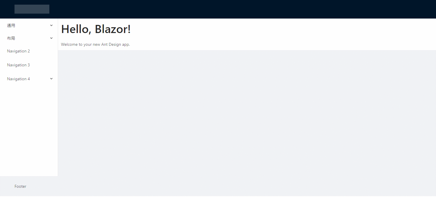
先来看看Button按钮,它支持多种风格,是否只显示图标,loading状态等。实现步骤及主要代码且听我娓娓道来,
1、引用样式文件
首先去antd.css cdn 下载稳定版的css文件,放到 wwwroot 文件夹下。再 _Host.cshtml 引用该文件。

2、建立 AButtonBase 类
AButtonBase类定义了按钮的属性参数;注册了class名称(例如:class="ant-btn ant-btn-primary")的计算表达式,class内容是根据属性参数的设置情况计算出来的。
属性set 的 ClassMapper.Dirty() 是通知样式名生成方法属性改变了需要重新生成样式名称。
而ClassMapper是用于注册组件需要用到的样式构建类,PrefixCls()是添加样式共用的前缀,Add有多个重载,可以是直接的样式名称;也可以是根据第一个参数的bool表达式来确定,第二个参数的样式是否启用。
using BlazorAntDesign.Core;
using Microsoft.AspNetCore.Components;
using Microsoft.AspNetCore.Components.RenderTree;
using System;
using System.Collections.Generic;
using System.Linq;
using System.Threading.Tasks;

namespace BlazorAntDesign.General
{    public class AButtonBase : BaseComponent
    {
        #region Properties
        /// <summary>
        /// 设置按钮大小,可选值为 Small、Large 或者不设
        /// </summary>
        [Parameter]
        protected AButtonSizes ButtonSize
        {
            get => buttonSize;
            set
            {
                buttonSize = value;
                ClassMapper.Dirty();
            }
        }
        private AButtonSizes buttonSize = AButtonSizes.Default;

        /// <summary>
        /// 设置按钮类型,可选值为 Primary、Dashed、Danger 或者不设
        /// </summary>
        [Parameter]
        protected AButtonTypes ButtonType
        {
            get => buttonType;
            set
            {
                buttonType = value;
                ClassMapper.Dirty();
            }
        }
        private AButtonTypes buttonType = AButtonTypes.Default;

        /// <summary>
        /// 设置按钮形状,可选值为 Circle、 Round 或者不设
        /// </summary>
        [Parameter]
        protected AButtonShapes ButtonShape
        {
            get => buttonShape;
            set
            {
                buttonShape = value;
                ClassMapper.Dirty();
            }
        }
        private AButtonShapes buttonShape = AButtonShapes.Default;

        /// <summary>
        /// 设置 button 原生的 type 值,可选值请参考 HTML 标准
        /// </summary>
        [Parameter]
        protected AButtonHTMLTypes HtmlType { get; set; } = AButtonHTMLTypes.Button;

        /// <summary>
        /// 按钮标题
        /// </summary>
        [Parameter]
        protected string Title
        {
            get => title;
            set
            {
                title = value;
                ClassMapper.Dirty();
            }
        }
        private string title;

        /// <summary>
        /// 设置按钮的图标名称
        /// </summary>
        [Parameter]
        protected string IconName { get; set; }

        /// <summary>
        /// 将按钮宽度调整为其父宽度的选项
        /// </summary>
        [Parameter]
        protected bool Block
        {
            get => block;
            set
            {
                block = value;
                ClassMapper.Dirty();
            }
        }
        private bool block;

        /// <summary>
        /// 幽灵属性,使按钮背景透明。幽灵按钮将按钮的内容反色,背景变为透明,常用在有色背景上。
        /// </summary>
        [Parameter]
        protected bool Ghost
        {
            get => ghost;
            set
            {
                ghost = value;
                ClassMapper.Dirty();
            }
        }
        private bool ghost;

        /// <summary>
        /// 设置按钮载入状态
        /// </summary>
        [Parameter]
        protected bool Loading
        {
            get => loading;
            set
            {
                loading = value;
                ClassMapper.Dirty();
            }
        }
        private bool loading;

        /// <summary>
        /// 按钮失效状态
        /// </summary>
        [Parameter]
        protected bool Disabled { get; set; }

        [Parameter]
        protected RenderFragment ChildContent { get; set; }

        /// <summary>
        /// 点击按钮时的回调
        /// </summary>
        [Parameter]
        public EventCallback<UIMouseEventArgs> OnClick { get; set; }
        //protected System.Action Clicked { get; set; }


        protected bool click_animating { get; set; }
        #endregion

        protected override void RegisterClasses()
        {
            ClassMapper.PrefixCls("ant-btn")
                    .Add(() => ClassMapper.GetEnumName(buttonSize))
                    .Add(() => ClassMapper.GetEnumName(buttonType))
                    .Add(() => ClassMapper.GetEnumName(buttonShape))
                    .Add(() => Block, () => "block")
                    .Add(() => Ghost, () => "background-ghost")
                    .Add(() => Loading, () => "loading")
                    .Add(() => string.IsNullOrEmpty(title) && ChildContent == null, () => "icon-only");

            base.RegisterClasses();
        }

        protected void buttonDown()
        {
            click_animating = false;
        }

        protected void buttonUp()
        {
            click_animating = true;
        }


    }
}
AButtonSizes、AButtonTypes、AButtonShapes、AButtonHTMLTypes 属性参数是定义的枚举,例如:
namespace BlazorAntDesign.General
{
    /// <summary>
    /// 按钮尺寸选项
    /// </summary>
    public enum AButtonSizes
    {
        /// <summary>
        /// 缺省,中
        /// </summary>
        [ClassNamePart("")]
        Default,

        /// <summary>
        /// 大
        /// </summary>
        [ClassNamePart("lg")]
        Large,

        /// <summary>
        /// 小
        /// </summary>
        [ClassNamePart("sm")]
        Small
    }
}
namespace BlazorAntDesign.General
{
    /// <summary>
    /// 按钮类型选项
    /// </summary>
    public enum AButtonTypes
    {
        /// <summary>
        /// 缺省,次按钮
        /// </summary>
        [ClassNamePart("")]
        Default,

        /// <summary>
        /// 主按钮
        /// </summary>
        Primary,

        /// <summary>
        ///
        /// </summary>
        Ghost,

        /// <summary>
        /// 虚线按钮
        /// </summary>
        Dashed,

Danger
    }
}
AButtonBase类继承自自定义的BaseComponent,BaseComponent继承自Blazor的ComponentBase类。
BaseComponent主要定义了所有组件共用的属性,ElementId、Style、ClassMapper等,
using System;
using System.Collections.Generic;
using System.Linq;
using System.Threading.Tasks;
using Microsoft.AspNetCore.Components;

namespace BlazorAntDesign.Core
{
    public abstract class BaseComponent : ComponentBase, IDisposable
    {
        #region Members

        private bool disposed;


        private ElementRef elementRef;

        #endregion

        #region Constructors

        public BaseComponent()
        {
            ElementId = Utils.IDGenerator.Instance.Generate;

            ClassMapper = new ClassMapper();
            RegisterClasses();
        }

        #endregion

        #region Methods
        protected virtual void RegisterClasses()
        {
            ClassMapper.AddCustomClass(() => customClass);
        }

        public void Dispose()
        {
            Dispose(true);
            GC.SuppressFinalize(this);
        }

        protected virtual void Dispose(bool disposing)
        {
            if (!disposed)
            {
                if (disposing)
                {
                    if (ClassMapper != null)
                    {
                        //ClassMapper.Dispose();
                        ClassMapper = null;
                    }
                }

                disposed = true;
            }
        }

        #endregion

        #region Properties

        /// <summary>
        /// 定义用户自定义的 ClassName
        /// </summary>
        [Parameter]
        protected string ClassName
        {
            get => customClass;
            set
            {
                customClass = value;
                ClassMapper.Dirty();
            }
        }
        private string customClass;

        /// <summary>
        /// Gets the reference to the rendered element.
        /// </summary>
        public ElementRef ElementRef { get => elementRef; protected set => elementRef = value; }

        /// <summary>
        /// 获取 element 唯一 Id.
        /// </summary>
        public string ElementId { get; }

        [Parameter]
        protected string Style { get; set; }

        /// <summary>
        /// 获取 ClassMapper.
        /// </summary>
        protected ClassMapper ClassMapper { get; private set; }

        #endregion
    }
}
3、建立 AButton.razor
@inherits BlazorAntDesign.General.AButtonBase

<button class="@ClassMapper.Class"
        type="@(Enum.GetName(typeof(AButtonHTMLTypes), HtmlType).ToLower())"
        ant-click-animating-without-extra-node="@(click_animating ? "true" : "")"
        disabled="@Disabled"
        @onkeydown="@buttonDown"
        @onmousedown="@buttonDown"
        @onkeyup="@buttonUp"
        @onmouseup="@buttonUp"
        @onclick="@OnClick">
    @*图标*@
    @if (Loading)
    {<AIcon IconName="loading"></AIcon>}
    else
    {
        if (!string.IsNullOrEmpty(IconName))
        {<AIcon IconName="@IconName"></AIcon>}
    }
    @*标题*@
    @if (!string.IsNullOrEmpty(Title))
    {<span>@Title</span>}
@*子内容*@
    @ChildContent</button>
其中 @inherits BlazorAntDesign.General.AButtonBase 是代码隐藏方式,指定后台代码继承自AButtonBase类,button class="@ClassMapper.Class",将采用的样式根据指定的属性值计算出来赋值给button的class属性。下面根据属性设置判断是否显示图标、标题、子内容。
4、使用 AButton
建立DemoButton.razor文件,样例代码如下:
@page "/DemoButton"
@using BlazorAntDesign.General;


<div style="border:1px solid beige;padding:10px">
    <AButton Title="Default"></AButton>
    <AButton Title="Primary" ButtonType="AButtonTypes.Primary"></AButton>
    <AButton Title="Danger" ButtonType="AButtonTypes.Danger"></AButton>
    <AButton Title="Dashed" ButtonType="AButtonTypes.Dashed"></AButton>
    <AButton Title="Disabled" Disabled="true"></AButton>
    <AButton ButtonType="AButtonTypes.Primary" IconName="download" ButtonShape="AButtonShapes.Circle"></AButton>
    <AButton Title="下载" ButtonType="AButtonTypes.Primary" IconName="download" ButtonShape="AButtonShapes.Round"></AButton>
    <AButton Title="下载" ButtonType="AButtonTypes.Primary" IconName="download"></AButton>
    <AButtonGroup><AButton ButtonType="AButtonTypes.Primary" IconName="left">Backward</AButton><AButton ButtonType="AButtonTypes.Primary">Forward<AIcon IconName="right" /></AButton></AButtonGroup>
    <AButton Title="Loading" ButtonType="AButtonTypes.Primary" Loading="true"></AButton>
    <AButton Title="Click me!" ButtonType="AButtonTypes.Primary" Loading="@isLoading" OnClick="@(()=> { isLoading = true; })"></AButton>
</div>
<div style="border:1px solid beige;padding:10px;margin-top:5px">
    <AButton IconName="search" ButtonType="AButtonTypes.Primary" ButtonShape="AButtonShapes.Circle"></AButton>
    <AButton IconName="search" ButtonType="AButtonTypes.Primary">按钮</AButton>
    <AButton IconName="search" ButtonShape="AButtonShapes.Circle"></AButton>
    <AButton IconName="search">按钮</AButton>
    <AButton IconName="search" ButtonType="AButtonTypes.Dashed" ButtonShape="AButtonShapes.Circle"></AButton>
    <AButton IconName="search" ButtonType="AButtonTypes.Primary">按钮</AButton>
</div>

@code{
    private bool isLoading = false;

    private void LoadingClick()
    {
        isLoading = true;
    }
}
@page "/DemoButton" 为组件路由
@using BlazorAntDesign.General; 为应用组件命名空间
好了Button的实现思路今天就学习到这了,希望有兴趣的同仁共同学习探讨,让Blazor真正走向SPA开发的舞台,让.net core七龙珠面向全栈开发,更好的拥抱社区,刷新业界对.net体系的认知。
番 外 篇
Blazor 在发展:
微软已将 Blazor 移出了实验阶段,进入了官方预览版。使用组件模型进行服务器端渲染的 Blazor 版本将与.NET Core 3 的最终版本一起发布(请参阅.NET Core 路线图),客户端版本将在随后不久发布。还有工作要完成:调试体验极其有限,必须改进;有机会通过提前编译生成本机 Wasm 来优化代码性能;在将未使用的代码库发送到浏览器之前,需要从库中删除未使用的代码,从而降低总体大小(这个过程称为树抖动)。对 WebAsssembly 的兴趣和采用与日俱增,借助 Blazor,编写可以在任何地方运行的 C#和.NET 代码的梦想终于实现了。
.net core将踏上新的征程:
Recommend
About Joyk
Aggregate valuable and interesting links.
Joyk means Joy of geeK