

Google Pixel 3a Display Review - Mid-range with Incredible Color Accuracy
source link: https://www.xda-developers.com/google-pixel-3a-display-review/
Go to the source link to view the article. You can view the picture content, updated content and better typesetting reading experience. If the link is broken, please click the button below to view the snapshot at that time.
Google Pixel 3a Display Review — Mid-Range With Top-of-the-Line Color Accuracy
Google’s newest handset, the Pixel 3a, has been making tons of headlines—at its forefront, it boasts the renowned imaging prowess of the Pixels’ cameras at a more affordable price range, and it maintains the simplicity and aesthetic of its pricier counterparts.
Much to my surprise, the Google Pixel 3a not only comes with flagship-competing cameras, but its display is among the most color-accurate in the smartphone world in its Natural color profile, which complements its imaging chops really well. It’s not really that surprising, though; Google has been leading the pack in chroma calibrations for a while now, and every Pixel phone so far has been very well-tuned for color, even the dreaded Pixel 2 XL (which was plagued with other issues, but chroma calibration wasn’t one of them). However, the Pixel 3a display’s strengths end there.
|
|
xda DISPLAY GRADE B‐ |
Google Pixel 3a Performance Summary
The Pixel 3a uses a 5.6-inch 2220×1080 (18.5:9) Samsung panel with 441 pixels per inch. For a mid-range display, it’s considerably sharp, and it should appear as sharp as most flagships unless you tend to handle your phones really close or just have extraordinary visual acuity.
The uniformity on my panel is okay—all sectors of the display are less than a ΔE of 2 from the center, with a barely-noticeable ΔE of 2.6 comparing the top-left of the display to the top-right, since there is a slightly warmer “bleed” on the top-right of my display.
For the Pixel 3 and Pixel 3 XL, Google put in excellent polarization layers that significantly lowered screen reflections and viewing angle tints, and those had to be compromised in cutting costs for the Pixel 3a. The Pixel 3a is using less-effective layers, shifting segments of the display towards red, green, or blue at small sudden angles and rainbowing out near the edges. They also don’t filter out as much incident light as current flagships, causing higher screen reflections, and allowing the OLED layer to bleed through and become more visible. The circular polarizer layer, which was introduced in the Pixel 2, was also omitted on the Pixel 3a.
The display brightness is bottom-of-the-barrel in typical Google style. The display gets just about as bright as any other Google phone, about 400–450 nits. There is most certainly a high brightness mode in the panel that Google does not wish to tap in to, but perhaps since the Pixel 3a has a mid-range panel it might not get that much brighter anyway. There is a lot to be desired from all of Google’s displays, as none of them are particularly enjoyable to use outdoors.
The Pixel 3a defaults to a color saturation-expanding profile that Google calls “Adaptive”, though I’m still not certain what’s “adaptive” at all about it. I’m still strongly averse to this decision, as I believe content should be originally served how it was meant to while keeping the setting to increase content saturation as an option. The Boosted profile is the Natural profile with a roughly 10% increase in saturation, though this profile should instead be a saturation slider since there is a system resource that controls the saturation level of the display between 0% and 200%, with Boosted simply setting the value to 1.1 (110%).
The color-accurate profile is the Natural profile, which I’ve measured to be the most chromatically accurate on the Android side of handsets in reproducing the sRGB color space. This is the profile that should be the default, given how accurate Google has calibrated it along with the news that wide color photos are coming to Android, which wouldn’t work properly in the Adaptive profile due to its lack of color management. Unfortunately, the panel in the Pixel 3a does not fully cover the P3 color space since its red emitter does not get saturated enough. The white point in this profile, as well as in the other two profiles, appear completely accurate to D65, although Google lists the Pixel 3a to have a D67 white point. The tone response of the display tends to render color tones just-slightly darker than standard, resulting in a display with slightly more contrast than what is considered accurate. At the low end, the Pixel 3a has a bit of trouble reproducing very dark scenes, and it does clip blacks a bit more than other displays.
Methodology ▼
Color Profiles
The Google Pixel 3a maintains the same three profiles as on the previous Pixels: Natural, Boosted, and Adaptive, with Adaptive as the default.
The Natural profile is the accurate, color-managed profile that targets the sRGB color space for non-contexted color values. Despite Google’s specification sheet listing the Pixel 3a as having a D67 white point, I measured the Natural profile to have an astoundingly accurate D65 white point across its brightness range.
The Boosted profile is based on the Natural profile and, according to Google, increases saturation in all directions by 10%. This description isn’t completely faithful, however, since the perception of the boost in color differs for the three primaries: Green colors receive the highest increase in perceived saturation, followed by reds, and blues show almost no discernible boost. Furthermore, the boost in saturation for red and green isn’t in the same hue direction, with greens tinting slightly towards yellow, giving them a slightly warmer tint, and reds also tinting towards yellow, making them appear more orange. The profile is actually still very color-accurate, save for highly-saturated reds-to-greens.
The default Adaptive profile stretches out the saturation of all colors: Greens are saturated the most and tinted slightly cooler, while reds and blues are saturated about equally, with reds tinting towards yellow. The profile shares the same white point as the Natural profile, which differs from the Pixel 3 where their Adaptive profile has a cooler white point than the Natural profile.
Brightness
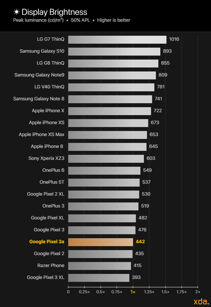
Our display brightness comparison charts compare the maximum display brightness of the Google Pixel 3a relative to other displays that we have measured. The labels on the horizontal axis on the bottom of the chart represent the multipliers for the difference in perceived brightness relative to the Google Pixel 3a display, which is fixed at “1×”. The magnitude of the displays’ brightnesses, measured in candelas per square meter, or nits, are logarithmically scaled according to Steven’s Power Law using the modality exponent for the perceived brightness of a point source, scaled proportionally to the brightness of the Google Pixel 3a display. This is done because the human eye has a logarithmic response to perceived brightness. Other charts that present brightness values on a linear scale do not properly represent the difference in perceived brightness of the displays.
When measuring the display performance of an OLED panel, it is important to understand how its technology differs from traditional LCD panels. LCDs require a backlight to pass light through color filters that block wavelengths of light to produce the colors that we see. An OLED panel is capable of having each of its individual subpixels emit their own light. This means that the OLED panel must share a certain amount of power to every lit pixel from its maximum allotment. Thus, the more subpixels that need to be lit up, the more that the panel’s power needs to be divided over the lit subpixels, and the less power that each subpixel receives.
The APL (average pixel level) of an image is the average proportion of each pixels’ individual RGB components across the entire image. As an example, a completely red, green, or blue image has an APL of 33%, since each image consists of completely lighting up only one of the three subpixels. The complete color mixtures cyan (green and blue), magenta (red and blue), or yellow (red and green) have an APL of 67%, and a full-white image that completely lights up all three subpixels has an APL of 100%. Furthermore, an image that is half black and half white has an APL of 50%. Finally, for OLED panels, the higher the total on-screen content APL, the lower the relative brightness of each of the lit pixels. LCD panels do not exhibit this characteristic (barring local dimming), and because of it, they tend to be much brighter at higher APLs than OLED panels.
Google doesn’t have a history of having bright displays—at all—and the Pixel 3a is no different. This is more acceptable on the Pixel 3a, however, since it’s Google’s mid-range device. At 50% APL, which is a good pixel level to attribute to the typical brightness of a display, the Pixel 3a emits 442 nits, which is middle-of-the-road for displays without a high brightness mode and is completely fine for its price point. The brightness drops off to a minimum of 406 nits at 100% APL, which is also just fine. At these brightness levels, the display does have legibility issues outdoors, which users will have to keep in mind.
At its dimmest, the Google Pixel 3a can achieve a white level as low as 1.7 nits, which is dimmer than what most other handset displays are capable of (excluding handsets capable of DC dimming), including the Samsung Galaxy S10 (1.8 nits) and the Apple iPhone XS (1.8 nits). The Pixel 3a gets much noticeably dimmer than the Pixel 3 (-29%) and the Pixel 3 XL (-23%).
Contrast & Tone Response
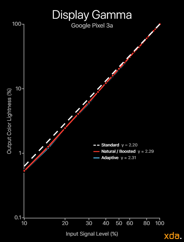
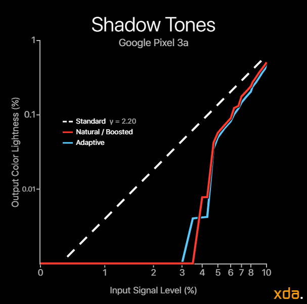
The gamma of a display determines the overall image contrast and lightness of the colors on a screen. The industry standard gamma that is to be used on most displays follows a power function of 2.20. Higher display gamma powers will result in higher image contrast and darker color mixtures, which the film industry is progressing towards, but smartphones are viewed in many different lighting conditions where higher gamma powers are not appropriate. Our gamma plot below is a log-log representation of a color’s lightness as seen on the Google Pixel 3a display versus its associated input drive level. Measured points that are higher than the 2.20 line mean the color tone appears brighter than standard, while lower than the 2.20 line means the color tone appears darker than standard. The axes are scaled logarithmically since the human eye has a logarithmic response to perceived brightness.
Most modern flagship smartphone displays now come with calibrated color profiles that are chromatically accurate. However, due to the OLED property of lowering the average lightness of the colors on the screen with increasing content APL, the main difference in the total color accuracy of modern flagship OLED displays is now in the resulting gamma of the display. The gamma makes up the achromatic (grayscale component) image, or the structure of the image, which humans are more sensitive in perceiving. Therefore, it is very important that the resulting gamma of a display matches that of the content’s, which typically follows the industry standard 2.20 power function.
The Google Pixel 3a has a fairly accurate display gamma, albeit just-slightly higher than standard, resulting in slightly darker color tones which are more prevalent in highly saturated patches.
The Google Pixel 3a slightly flops in rendering shadow details, consistently rendering shadows darker and crashing in luminance below 5% signal level. The Pixel 3a clips completely black at signal levels below 3% (color byte values below 7) at 200 nits, which correlates to luminance values below ~0.008 nits. This performs considerably worse than most OLEDs, including that of the Pixel 3 XL, but not as bad as on the Pixel 3. Google’s Pixel phones have consistently had subpar black rendering, and it is certainly due to their calibration and not hardware.
Color Accuracy
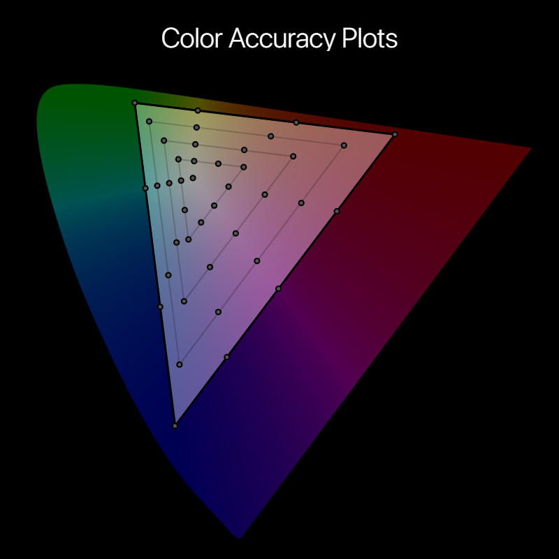
Our color accuracy plots provide readers with a rough assessment of the color performance and calibration trends of a display. Shown below is the base for the color accuracy targets, plotted on the CIE 1976 chromaticity scale, with the circles representing the target colors.
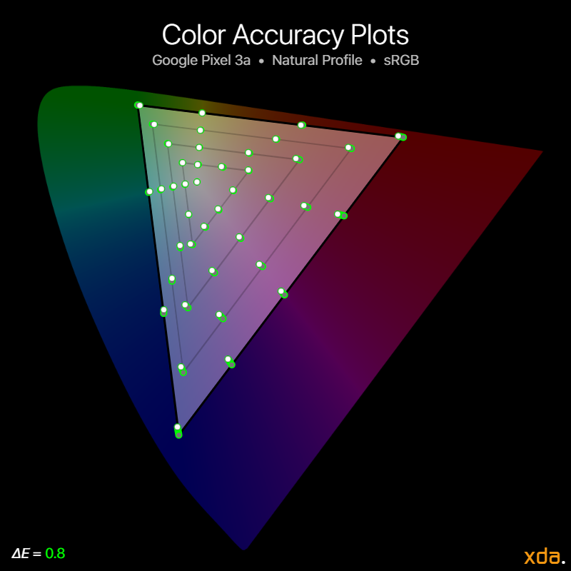
In the color accuracy plots below, the white dots represent the position of the Google Pixel 3a’s measured colors. The associated trailing color represents the severity of the color error. Green trails signify that the measured color difference is very small and that the color appears accurate on the display, while yellow trails indicate noticeable color differences, with higher severity at orange and red trails.
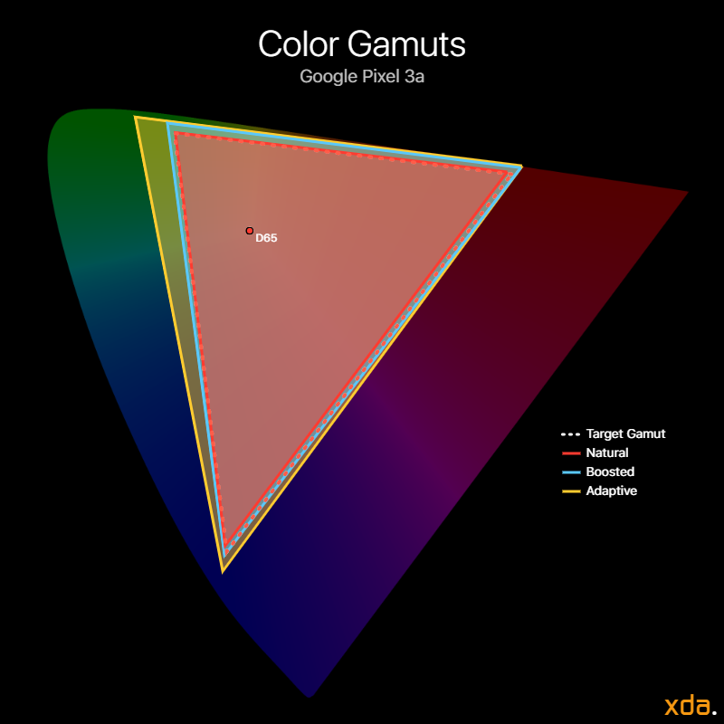
The Natural profile is as accurate as it gets—the Pixel 3a can reproduce the sRGB color space without blemish (save for black clipping). The profile has an indistinguishable-from-perfect average color error ΔE of 0.8 with a very low standard deviation of 0.5. The largest color difference we measured read a ΔE of 2.5 at 75%-saturation blue, which is unnoticeable and appears accurate.
The Google Pixel 3a panel cannot fully cover the P3 gamut since the red emitter does not get saturated enough, but the Natural profile still reproduces the rest of the P3 color space really well. The attraction to the P3 color space does lie in those high-saturation reds, however, so although the average overall color difference of the Natural profile to the P3 color space is low, it is not a well-representative metric unless it can hit those deep reds.
Drive Balance
The color temperature of a white light source describes how “warm” or “cold” the light appears. Color typically needs at least two points to be described, while the correlated color temperature is a one-dimensional descriptor that leaves out essential chromaticity information for simplicity.
The sRGB color space targets a white point with a D65 (6504 K) color temperature. Targeting a white point with D65 color temperature is essential in color accuracy since the white point affects the appearance of every color mixture. Note that, however, a white point with a correlated color temperature that is close to 6504 K may not necessarily appear accurate! There are many color mixtures that can have the same correlated color temperature (called iso-CCT lines) — some that don’t even appear white. Because of this, the color temperature should not be used as a metric for white point color accuracy. Instead, we use it as a tool to represent the rough appearance of the white point of a display and how it shifts over its brightness and grayscale. Regardless of the target color temperature of a display, ideally its correlated color temperature of white should remain consistent at all drive levels, which would appear as a straight line in our chart below.
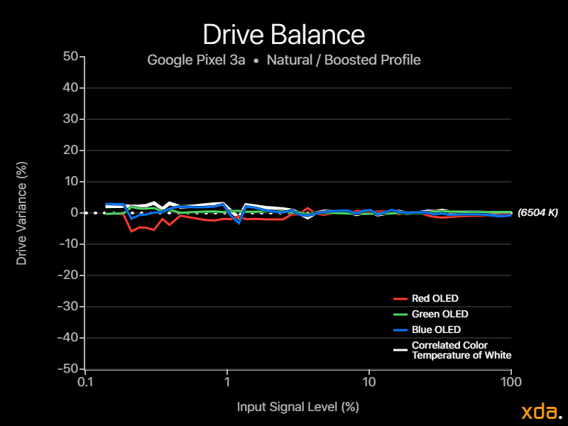
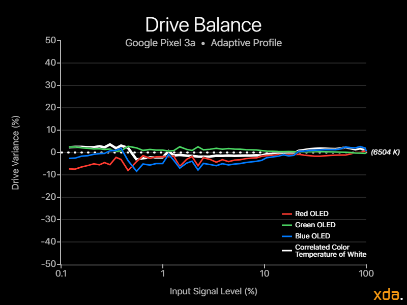
The drive balance charts show how the intensities of the individual red, green, and blue LEDs vary with display brightness, overlain with the display’s correlated color temperature of white, and they reveal the “tightness” of the color calibration of the display. The charts show much more color information than the one-dimensional color temperature chart. Ideally, the red green and blue LEDs should remain as consistent as possible throughout the display’s brightness range.
The Natural profile is calibrated tightly with very little variance, maintaining an accurate D65 white point even at low signal levels. This means that there should be little-to-no discernible shift in the colors on the Pixel 3a display when rendering them at a different brightness, and the color will maintain its chromaticity when rendered at a lighter or darker tone. This is important since many displays shift the appearance of the colors, especially the white point, either warmer or cooler as brightness increases or decreases. The Google Pixel 3a display renders colors consistently throughout its brightness range in its Natural profile, and this is a very impressive calibration feat only similarly achieved by Apple. The Pixel 3 and Pixel 3 XL are not calibrated this tightly, most likely due to their wider gamuts, so it is very impressive to see it in Google’s mid-range handset.
Vendor panels are usually baseline factory-calibrated at or near their native gamut, so it isn’t unusual for color profiles with the widest gamut to be calibrated the most tightly. That doesn’t seem to be the case with the Adaptive profile, as we measured a higher variance from the profile than on the Natural profile. This is because the Adaptive profile isn’t just based on the panel’s native gamut, so it requires additional color mixing and LUTs at different signal levels to keep them consistent. The calibration is also imperfect since the profile targets a red primary that is not within the Pixel 3a panel’s native gamut. The resulting white balance for the Adaptive profile is still consistent, but the red and blue LEDs are quite finicky below 10% signal level.
Google Pixel 3a Display Overview
| Specification | Google Pixel 3a | Notes |
|---|---|---|
| Type | OLED PenTile Diamond Pixel | |
| Manufacturer | Samsung Display Co. | |
| Size | 5.0 inches by 2.4 inches 5.6-inch diagonal 12.3 square inches | |
| Resolution | 2220×1080 pixels 18.5:9 pixel aspect ratio | Actual number of pixels is slightly less due to rounded corners |
| Pixel Density | 312 red subpixels per inch 441 green subpixels per inch 312 blue subpixels per inch | PenTile Diamond Pixel displays have fewer red and blue subpixels compared to green subpixels |
| Distance for Pixel Acuity | <11.0 inches <7.8 inches for achromatic image Good | Distances for just-resolvable pixels with 20/20 vision. Typical smartphone viewing distance is about 12 inches |
| Brightness | 442 nits @ 50% APL 406 nits @ 100% APL 484 nits @ 1% APL Fair 14% variance with APL | Dynamic brightness is the change in screen luminance in response to displayed content APL |
| Angular Shift | -25% brightness shift ΔE = 5.7 color shift | Measured at a 30-degree incline |
| Specification | Natural | Adaptive | Notes |
|---|---|---|---|
| Gamma | 2.21–2.35 Average 2.29Fair | 2.23–2.36 Average 2.31 | Standard is a straight gamma of 2.20 |
| White Point | 6521 K ΔE = 0.9Indistinguishable from perfect | 6542 K ΔE = 0.9Accurate to standard | Standard is 6504 K |
| Color Difference | Average ΔE = 0.8 ± 0.5 Maximum ΔE = 2.5 Exceptionally accurate | Average ΔC = 12.3 ΔC = 12.3 for red / ΔH = 5.4 towards yellow ΔC = 24.9 for green / ΔH = 4.1 towards cyan ΔC = 12.9 for blue / ΔH = 0.2 towards cyan Very vibrant | ΔE values below 2.3 appear accurate ΔE values below 1.0 appear indistinguishable from perfect ΔC measures difference just in saturation relative to sRGB colors ΔH measures difference in hue relative to sRGB colors |
Pixel 3a Forums and Product Page
Interested in the Pixel 3a? Join the XDA forums for the device where you can ask questions and share accessories, tips, tricks, and other mods. If you want to purchase the device, you can visit its product page on the Google Store. The Pixel 3a can be bought from the Google Store if you live in Australia, Canada, France, Germany, India, Ireland, Italy, Japan, Singapore, Spain, Taiwan, United Kingdom, or the United States.
Recommend
About Joyk
Aggregate valuable and interesting links.
Joyk means Joy of geeK