

Expanding Cells in iOS Collection Views [FREE]
source link: https://www.tuicool.com/articles/hit/Frm6Rji
Go to the source link to view the article. You can view the picture content, updated content and better typesetting reading experience. If the link is broken, please click the button below to view the snapshot at that time.
Update note : Naeem Shaikh updated this tutorial for Swift 4.2, iOS 12, and Xcode 10. Chris Lowe wrote the original article.
Expanding collection view cells
When Apple introduced collection views with iOS 6 in 2012, many people thought they were the answer to the roadblocks and limitations of customizing table views. Some even proposed
to deprecate UITableView
.
Out of the box, UICollectionView
is a powerful and ultra-flexible way to present data in your apps. However, one downside is that, without some level of customization, your app looks bland and fails to stand out among the millions of apps in the App Store.
In this tutorial, you’re going to take a rather plain “templated” app of different colored items and turn it into a visually appeasing way to browse RWDevCon inspiration talk sessions using a collection view.
You’ll add awesome parallax effects and a featured cell item, as well as dabble in subtle fading and transitions to make it really stand out from other apps. The end result is a look and feel similar to the UltraVisual app. If you haven’t seen it, get it now — it’s free!
Note
: This tutorial requires a basic knowledge of UICollectionViewController
, or its close cousin UITableViewController
, and an understanding of the basics of the Swift language. If you’re not familiar with it, you can learn more about it in our written or video tutorial series:
Ready to stand out with your collection view? Read on!
Getting Started
Download the Ultravisual Kit project using the Download Materials button at the top or bottom of this tutorial. Open the Starter project in Xcode 10. Inside, you’ll find a simple storyboard project with several classes. These are conveniently separated into folders to help you navigate around the project.
The folders contain the following:
- Assets : Contains Images.xcassets , Inspirations.plist and Inspirations.xcassets , which the app uses to load the images for the RWDevCon speakers.
-
Controllers
: Contains InspirationsViewController.swift
, a
UICollectionViewControllersubclass. - Extensions : Contains UIColor+Palette.swift and UIImage+Decompression.swift , which provide convenience methods that handle color conversion and image decompression, respectively. The starter project uses the color palette and, in a future step, you’ll switch to using images and the decompression method.
-
Layouts
: Contains UltravisualLayout.swift
, which is the meat of the project. As a subclass of
UICollectionViewLayout,UICollectionViewasks this class for a definition of how to properly lay out and place the items in the collection view. Inside, you’ll find a set of constants and convenience methods that you’ll use to simplify setting up your layout. Additionally, it provides a simple custom cache ofUICollectionViewLayoutAttributesthat are used to modify each cell. - Models : Contains the data models for the background images ( Inspiration.swift ) and session details ( Session.swift ); they are separated for the ultimate MVC-pattern win!
- Views : Contains InspirationCell.swift , which handles setting the properties of the collection view cell.
Build and run the starter project, and you’ll see the following:

The app looks decent (if you want a random color palette app, that is), but it doesn’t do much right now. That’s where your job comes in: You’ll turn this clunker into a beautiful app that’s designed to quickly scan through the list of inspirational speakers and topics from RWDevCon.
The technical magic of this project comes from managing the different cell item states:
- The standard cell (what you see in the starter project) that transitions into the “next up” cell, which grows a bit larger.
- The featured cell, which is the largest of all.
You’ll also use a little trickery — modifying the z-index of the cell as it scrolls — for a sweet stacking effect.
Creating Multiple Cell Sizes
First, you’ll create the featured cell. It’ll be roughly twice as large as the standard cell, so a user can clearly see which item is selected.
Jump to UltravisualLayout.swift
and go to prepare()
. After this line of code:
cache.removeAll(keepingCapacity: false)
Add a few new local variables that you’ll use across each item:
let standardHeight = UltravisualLayoutConstants.Cell.standardHeight
let featuredHeight = UltravisualLayoutConstants.Cell.featuredHeight

var frame = CGRect.zero
var y: CGFloat = 0
Next, add the following code to loop through each item in the collection view and adjust the item’s state accordingly:
for item in 0..<numberOfItems {
  // 1
  let indexPath = IndexPath(item: item, section: 0)
  let attributes = UICollectionViewLayoutAttributes(forCellWith: indexPath)

  // 2
  attributes.zIndex = item
  var height = standardHeight

  // 3
  if indexPath.item == featuredItemIndex {
    // 4
    let yOffset = standardHeight * nextItemPercentageOffset
    y = collectionView!.contentOffset.y - yOffset
    height = featuredHeight
  } else if indexPath.item == (featuredItemIndex + 1)
    && indexPath.item != numberOfItems {
    // 5
    let maxY = y + standardHeight
    height = standardHeight + max(
      (featuredHeight - standardHeight) * nextItemPercentageOffset, 0
    )
    y = maxY - height
  }

  // 6
  frame = CGRect(x: 0, y: y, width: width, height: height)
  attributes.frame = frame
  cache.append(attributes)
  y = frame.maxY
}
There is a lot going on in the loop, so here's a breakdown:
- Create an index path to the current cell, then create default attributes for it.
-
Prepare the cell to move up or down. Since the majority of cells will not
be featured — there are many more standard cells than the single featured cells — it defaults to the
standardHeight. - Determine the current cell's status — featured, next or standard. In the case of the latter, you do nothing.
-
If the cell is currently in the featured-cell position, calculate the
yOffsetand use that to derive the newyvalue for the cell. After that, you set the cell's height to be the featured height. -
If the cell is next in line, you start by calculating the largest
ycould be (in this case, larger than the featured cell) and combine that with a calculated height to end up with the correct value ofy, which is 280.0 — the height of the featured cell. -
Lastly, set some common elements for each cell, including creating the frame, setting the calculated attributes, and updating the cache values. The very last step is to update
yso that it's at the bottom of the last calculated cell so that you can move down the list of cells efficiently.
For the collection view to know which layout to use, you'll need to tell UICollectionView
to use UltravisualLayout
as its layout class.
First, open Main.storyboard and select the Collection View inside the Document Outline .

Next, open the Attributes inspector
and set the Layout
dropdown to Custom
, and then set the Class
to UltravisualLayout
.

Finally, before building, go to InspirationsViewController.swift
and, in viewDidLoad()
, remove the last two lines:
let layout = collectionViewLayout as! UICollectionViewFlowLayout
layout.itemSize = CGSize(width: collectionView!.bounds.width, height: 100)
These two lines were the basic layout to show the equally sized multi-colored cells. Now that you've specified layout code in UltravisualLayout
and set the custom layout class in the storyboard, you no longer need these lines.
Build and run, and you'll see this:

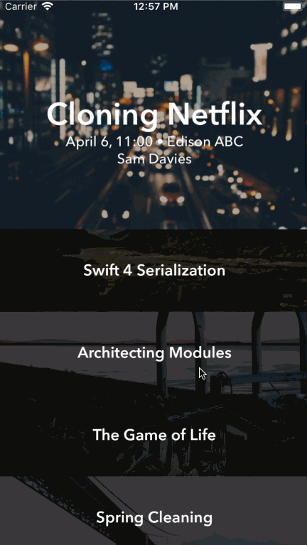
Notice that the top cell is much larger, effectively showcasing a featured cell. As you scroll, the cell below the featured cell expands and overlaps the current featured cell. What a nice effect!
Adding Cell Images
Colored cells are great and all, but RWDevCon cannot be expressed in color!
The starter project includes a set of images just begging to be used. (They're in Inspirations.xcassets if you want to steal a quick glance. :] )
But you can't just use them in any old way — if you're doing this tutorial, then, clearly, you're all about that awesome user experience.
Not only is it time to replace the colors with images, but you'll do so in such a way that the image actually reveals more of itself as the user scrolls the cell up to be a featured cell.
First, add a new image view to the collection view cell. Go to Main.storyboard , select InspirationCell , and resize it to 200✕200. This is not strictly necessary, but it helps you visually see what's going on more easily than the standard cell size does.

Next, open the Identity inspector and set the Class type as InspirationCell .

Then, drag-and-drop a UIImageView
object from the Xcode 10 Library
onto the cell. Select the UIImageView
you just added, go to the Attributes inspector
and change the Content Mode
to Aspect Fill
.

Now for a few Auto Layout constraints: Select the Add New Constraints menu at the bottom of the layout view and set up the constraints as follows:
- Uncheck Constrain to Margins .
- Set the leading and trailing spaces (the left and right boxes) to 0 .
- Check Height and set its value to 280 (the height of the featured cell).
- Click Apply 3 New Constraints .
It should appear something like this:

From the Align menu — located to the left of the Pin menu — select Vertically in Container and apply that single constraint.

This creates a cool effect that centers the image in the image view in proportion to the full height of the featured cell, but it appears masked by the standard cell height until the cell is fully in view.
Finally, add an outlet connection by right-clicking on InspirationCell
in the Document Outline and connecting the imageView
outlet to the UIImageView
that you just added.

Jump over to InspirationsViewController.swift
and replace the implementation of collectionView(_:cellForItemAt:)
with the following:
guard let cell = collectionView.dequeueReusableCell(
  withReuseIdentifier: InspirationCell.reuseIdentifier, for: indexPath)
  as? InspirationCell else {
    return UICollectionViewCell()
}
cell.inspiration = inspirations[indexPath.item]
return cell
Since you set the cell's class in Interface Builder, you start by casting to InspirationsCell
in the dequeue call. Rather than set the cell's background color, you set the cell's inspiration
property to the correct entry from the array of all inspirations.
Lastly, at the top of the file, remove the definition of the colors
array because you no longer need it.
Build and run — behold pure image glory!

Featuring Featured Cells
The new images look great, but one thing you'll notice is that all of the images are competing for your attention regardless of where they are in the list.
In reality, only the featured cell should grab your attention.
Next, you'll add a simple UIView
overlay to manage the opacity of each cell. This time, the trickery you'll use is a mask to darken cells as they move away from the featured view and lighten as they get closer to the top.
Go back to Main.storyboard
and add a UIView
under the UIImageView
you added previously.

In the Add New Constraints menu, uncheck Constrain to margins if it is selected, and this time, set all four Spacing to nearest neighbor values to 0 and select Add 4 Constraints .

Next, hook up the imageCoverView
outlet from InspirationCell
to the UIView
you just added. Select the view again, and, in Attributes inspector
, set the Background Color
to Black Color
.
Now that you've set up the UI to mask the images, it's time to update the mask in code.
Go to InspirationCell.swift in the Views folder and add the following method to the class:
override func apply(_ layoutAttributes: UICollectionViewLayoutAttributes) {
  super.apply(layoutAttributes)

  // 1
  let standardHeight = UltravisualLayoutConstants.Cell.standardHeight
  let featuredHeight = UltravisualLayoutConstants.Cell.featuredHeight

  // 2
  let delta = 1 - (
    (featuredHeight - frame.height) / (featuredHeight - standardHeight)
  )

  // 3
  let minAlpha: CGFloat = 0.3
  let maxAlpha: CGFloat = 0.75
  imageCoverView.alpha = maxAlpha - (delta * (maxAlpha - minAlpha))
}
This method updates the effects applied to the cell as it's rendering and moving up or down the screen. Here's what's happening step-by-step:
- These are the two convenience height constants that you've used previously.
- Calculate the delta of the cell as it's moving to figure out how much to adjust the alpha in the following step.
- Based on the range constants, update the cell's alpha based on the delta value.
The delta is calculated as a range of 0 to 1 as it determines the percentage of the height change from the standard height to the featured-height cells. From there, the alpha can be calculated as the percentage delta is applied to the acceptable alpha range, which is between 0.3 and 0.75, in this case.
Build and run!

Adding Session Details
At this point, you've got the images looking great with a subtle parallax effect and alpha transparency, and you're probably feeling ready to take a victory lap around your workstation.
But before you get too excited, keep in mind that there's just one problem: Without the context of the session talk, time and room, the images are little more than pretty pictures! You'll add those bits next.
First, add the session title to each item. Open Main.storyboard
and drag a UILabel
from the Library
onto the InspirationCell
in the Document Outline
. Make sure the label is created as a sibling, meaning it's on the same level in the hierarchy, of Image View
and View
.

Select the label and, in the Attributes inspector , make the following changes:
- Set Text to “Inspiration.”
- Set Color to White Color .
- Set Font to Custom , Family to Avenir Next , with a Style of Demi Bold and a Size of 38 .
- Set Alignment to Center .

With the label still selected, click the Add New Constraints button in the bottom right-hand corner of Interface Builder. In the pop-up, make sure Constrain to margins is unchecked, and then add the following layout constraints:
- Select Leading Space and set the constant to 0.
- Select Trailing Space and set the constant to 0.
- Select Height and set the constant to 44.
Select Add 3 Constraints .

Finally, click the Align button, select Vertically in Container , and select Add 1 Constraint :
Your cell should now look like this:

Next, you'll have to hook up the new label to the cell so that you can set the text correctly. Open InspirationCell.swift
and add a new property right after the declaration of imageCoverView
:
@IBOutlet private weak var titleLabel: UILabel!
Then, inside of the if
block of didSet
, add:
titleLabel.text = inspiration.title
This ensures that the text of the label updates each time the value of the property changes.
Jump back to Main.storyboard and right-click on InspirationCell in the Document Outline to show the connections pop-up. Drag from titleLabel to the label that you just created to connect the two:

Build and run — check out those sweet, sweet session titles!

You know what would be a cool effect on the title labels? Having them scale as the user scrolls!
Scaling Cells
Open InspirationCell.swift
and add the following to the bottom of apply(_:)
:
let scale = max(delta, 0.5)
titleLabel.transform = CGAffineTransform(scaleX: scale, y: scale)
Here, you create a constant that’s the greater of either delta
— which, if you remember, is a value between 0 and 1 — and 0.5; this is important because you don’t want the label to scale to less than half its full size.
Next, you use CGAffineTransform(scaleX:y:)
to create a scaled transform that you set on the label via its transform
property.
Build and run. You’ll see that the session titles in the standard cells are half the size of the title in the featured cell, and that the labels smoothly scale as the standard cells transition into being the featured cell:

Now, it’s time to add the remainder of the session details to the cell and make them fade into view as the user scrolls.
Adding Session Details
Open Main.storyboard and drag two more Labels from the Library onto the cell in the Document Outline . Again, make sure they’re created as siblings of the other views and not as children.
The updated Document Outline should look like the following:

Using the Attributes inspector, set Text of one of the labels to "Time, Room" and the other to "Speaker". Then make the following changes to both of them:
- Set Color to White Color .
- Set Font to Custom , Family to Avenir Next , with a Style of Medium and a Size of 17 .
- Set Alignment to Center .
In the storyboard canvas, drag the Time, Room label below the Inspiration label. Then drag the Speaker label below the Time, Room label so that they appear stacked atop one another.
Select the Time, Room label and click the Add New Constraints button. Make sure Constrain to margins is unchecked and then add the following layout constraints:
- Select Leading and set the constraint to 0.
- Select Top and set the constraint to 0 — make sure it’s referencing the Bottom of Inspiration (Title Label) by clicking on the dropdown arrow.
- Select Trailing and set the constant to 0.
Click Add 3 Constraints .
Now, select the Speaker label and add the same layout constraints, but this time make sure the Top space is referencing Time, Room and not Inspiration or InspirationCell .
If you have difficulty getting the right value to come up in the dropdown, try nudging the label further down the view a bit, say, by 10px, and look at the dropdown again. The view has to be sufficiently spaced so that Interface Builder can accurately detect what you're trying to do.
Your cell should now look like the following:

Jump back to InspirationCell.swift and add the following outlets, just below the others:
@IBOutlet private weak var timeAndRoomLabel: UILabel!
@IBOutlet private weak var speakerLabel: UILabel!
You'll use these to set the Time, Room , and Speaker details on their corresponding labels.
Now, add the following to the bottom of the if
block inside the didSet
observer for the inspiration
property:
timeAndRoomLabel.text = inspiration.roomAndTime
speakerLabel.text = inspiration.speaker
Just like the titleLabel
you set up previously, this ensures the values update whenever the inspiration
values change.
Jump back to Main.storyboard and right-click on InspirationCell in the Document Outline to invoke the connections pop-up.
Drag from timeAndRoomLabel to the middle label to connect them, and then drag from speakerLabel to the bottom label to connect those two.
Build and run. You’ll see that the session details now display as expected, but they don’t look quite right in the standard cells:

Time to fix that!
In InspirationCell.swift
, find apply(_:)
and add the following to the very bottom:
timeAndRoomLabel.alpha = delta
speakerLabel.alpha = delta
You’re simply setting the alpha
of each label to the delta variable, which, if you remember, represents the progress of the cell transitioning to be the featured cell.
By doing this, you’re making sure the session details aren’t visible in standard cells, but fade in as each cell becomes the featured cell.

Once again, build and run. You’ll now see that session details aren’t displayed on the standard cells but instead fade in as you scroll up:

What a thing of beauty! :]
Smooth Scrolling
There's one last thing you have to do to make this app's UI really pop; you're going to tweak the way the collection view scrolls so that one cell is always in full focus at the top of the screen. This will help your users focus on the content, rather than spending energy on scrolling to an exact position.
Open UltravisualLayout.swift and add the following method to the class:
override func targetContentOffset(
  forProposedContentOffset proposedContentOffset: CGPoint,
  withScrollingVelocity velocity: CGPoint) -> CGPoint {
  let itemIndex = round(proposedContentOffset.y / dragOffset)
  let yOffset = itemIndex * dragOffset
  return CGPoint(x: 0, y: yOffset)
}
This is a little-used method of UIScrollView
that allows your app to respond with an effect similar to the page-snapping effect of a paged UIScrollView
.
When the user lifts their finger after a scroll while there's still some scroll velocity, this method will look into the future and tell you exactly where the scroll will end thanks to the proposedContentOffset
. By returning a different scroll point, you can make the collection view end up right on an even boundary with a featured cell.
All you're doing in the implementation is finding the closest item to the proposed content offset and then returning a CGPoint
that's positioned so that item will be right against the top of the screen.
By default, a scroll view's deceleration rate is rather slow, which can make your target offset change look a bit strange. That's an easy fix though! Jump to InspirationsViewController.swift
, and, in viewDidLoad()
, add the following code to the end of the method:
collectionView?.decelerationRate = .fast
Build, run and you're done!

Challenge: Tap to Select
Oh, there's one more thing. It's pretty cool to be able to scroll that list around, but did you notice what happens when you tap a cell?
That's right — nothing. #boring.
Why not scroll a tapped cell to the top so that it gains focus? Take a shot at adding a new function to handle tapping events. Think about how you would handle selecting a row on a UITableView
for a similar treatment.
[spoiler]
In InspirationViewController.swift , make the cells handle the tap events by adding the following method to the class:
override func collectionView(_ collectionView: UICollectionView,
                             didSelectItemAt indexPath: IndexPath) {
  guard let layout = collectionViewLayout
    as? UltravisualLayout else {
      return
  }
  let offset = layout.dragOffset * CGFloat(indexPath.item)
  if collectionView.contentOffset.y != offset {
    collectionView.setContentOffset(
      CGPoint(x: 0, y: offset), animated: true
    )
  }
}
[/spoiler]
How close was your own code to the example solution?
Where to Go From Here
In this tutorial, you added several auto layout-based labels, subtle parallax effects and fading transitions to a standard UICollectionView
.
Keeping class responsibilities focused — especially for the view controllers — is one of the main challenges in iOS development, and you handled them like a boss in this tutorial.
You can download the completed version of the project using the Download Materials button at the top or bottom of this tutorial.
Now that you’ve covered the basics of adding a fancy expanding cell to UICollectionView
, try experimenting with 3D transforms or fiddling with the scaling values in the collection layout to see what other effects you can achieve.
If you're looking to learn more about custom layouts, consider the following resources:
- Read the Creating Custom Layouts section of the Collection View Programming Guide for iOS , which covers this subject extensively.
- Follow our Custom Collection View Layout Video Tutorial Series , where you can learn how to build amazing custom layouts inspired by popular iOS apps, and dig into some advanced topics like creating interactive layouts and manipulating scroll behavior.
If you have any questions about this tutorial, please join in the forum discussion below!
Recommend
About Joyk
Aggregate valuable and interesting links.
Joyk means Joy of geeK