

Python数据可视化工具pyecharts使用细则
source link: https://www.jiqizhixin.com/articles/2018-08-16-6?amp%3Butm_medium=referral
Go to the source link to view the article. You can view the picture content, updated content and better typesetting reading experience. If the link is broken, please click the button below to view the snapshot at that time.
前言
我们都知道python上的一款可视化工具 matplotlib ,而前些阵子做一个Spark项目的时候用到了百度开源的一个可视化JS工具- Echarts ,可视化类型非常多,但是得通过导入js库在Java Web项目上运行,平时用Python比较多,于是就在想有没有Python与Echarts结合的轮子。Google后,找到一个国人开发的一个Echarts与Python结合的轮子: pyecharts ,下面就来简述下 pyecharts 一些使用细则:
写这篇文章用的是Win环境,首先打开命令行(win+R),输入:
pip install pyecharts
但笔者实测时发现,由于墙的原因,下载时会出现断线和速度过慢的问题导致下载失败,所以建议通过清华镜像来进行下载:
pip install -i https://pypi.tuna.tsinghua.edu.cn/simple pyecharts
出现上方的信息,即代表下载成功,我们可以来进行下一步的实验了!
使用实例
使用之前我们要强调一点:就是 python2.x 和 python3.x 的编码问题,在python3.x中你可以把它看做默认是 unicode编码 ,但在python2.x中并不是默认的,原因就在它的bytes对象定义的混乱,而pycharts是使用unicode编码来处理字符串和文件的,所以当你使用的是python2.x时,请务必在上方插入此代码:
from __future__ import unicode_literals
现在我们来开始正式使用pycharts,这里我们直接使用官方的数据:
柱状图-Bar
//导入柱状图-Bar
from pyecharts import Bar
//设置行名
columns = ["Jan", "Feb", "Mar", "Apr", "May", "Jun", "Jul", "Aug", "Sep", "Oct", "Nov", "Dec"]
//设置数据
data1 = [2.0, 4.9, 7.0, 23.2, 25.6, 76.7, 135.6, 162.2, 32.6, 20.0, 6.4, 3.3]
data2 = [2.6, 5.9, 9.0, 26.4, 28.7, 70.7, 175.6, 182.2, 48.7, 18.8, 6.0, 2.3]
//设置柱状图的主标题与副标题
bar = Bar("柱状图", "一年的降水量与蒸发量")
//添加柱状图的数据及配置项
bar.add("降水量", columns, data1, mark_line=["average"], mark_point=["max", "min"])
bar.add("蒸发量", columns, data2, mark_line=["average"], mark_point=["max", "min"])
//生成本地文件(默认为.html文件)
bar.render()
运行结果如下:
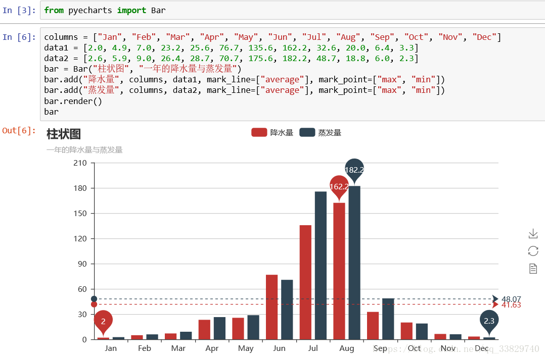
简单的几行代码就可以将数据进行非常好看的可视化,而且还是动态的,在这里还是要安利一下jupyter,pyecharts在v0.1.9.2版本开始,在jupyter上直接调用实例(例如上方直接调用bar)就可以将图表直接表示出来,非常方便。
笔者数了数,目前pyecharts上的图表大概支持到二十多种,接下来,我们再用上方的数据来生成几个数据挖掘常用的图表示例:
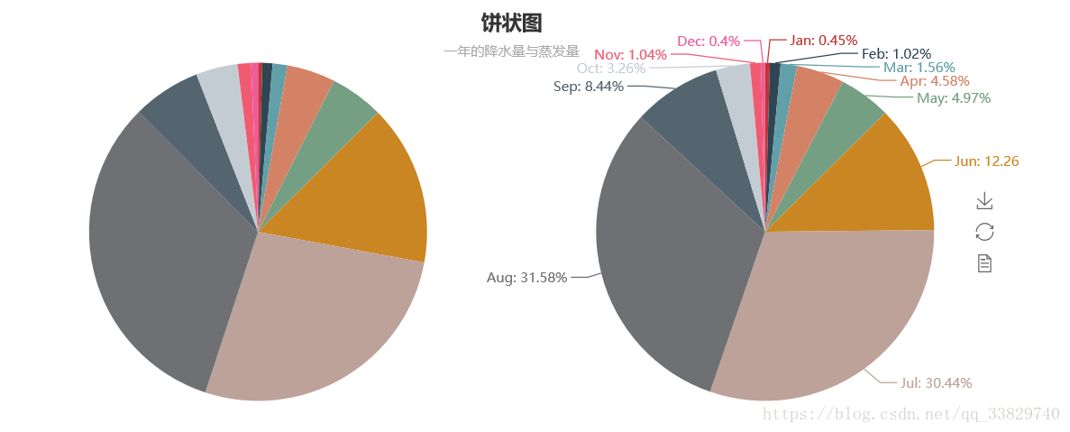
饼图-Pie
//导入饼图Pie
from pyecharts import Pie
//设置主标题与副标题,标题设置居中,设置宽度为900
pie = Pie("饼状图", "一年的降水量与蒸发量",title_pos='center',width=900)
//加入数据,设置坐标位置为【25,50】,上方的colums选项取消显示
pie.add("降水量", columns, data1 ,center=[25,50],is_legend_show=False)
//加入数据,设置坐标位置为【75,50】,上方的colums选项取消显示,显示label标签
pie.add("蒸发量", columns, data2 ,center=[75,50],is_legend_show=False,is_label_show=True)
//保存图表
pie.render()
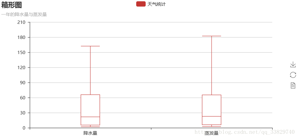
箱体图-Boxplot
//导入箱型图Boxplot
from pyecharts import Boxplot
boxplot = Boxplot("箱形图", "一年的降水量与蒸发量")
x_axis = ['降水量','蒸发量']
y_axis = [data1,data2]
//prepare_data方法可以将数据转为嵌套的 [min, Q1, median (or Q2), Q3, max]
yaxis = boxplot.prepare_data(y_axis)
boxplot.add("天气统计", x_axis, _yaxis)
boxplot.render()
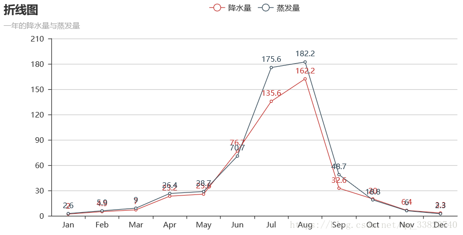
折线图-Line
from pyecharts import Line
line = Line("折线图","一年的降水量与蒸发量")
//is_label_show是设置上方数据是否显示
line.add("降水量", columns, data1, is_label_show=True)
line.add("蒸发量", columns, data2, is_label_show=True)
line.render()
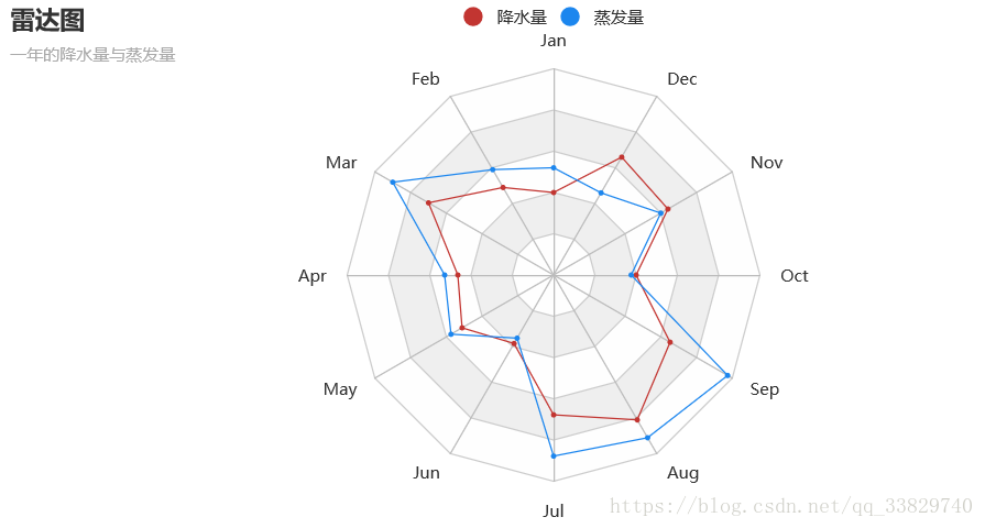
 雷达图-Rader
from pyecharts import Radar
radar = Radar("雷达图", "一年的降水量与蒸发量")
//由于雷达图传入的数据得为多维数据,所以这里需要做一下处理
radar_data1 = [[2.0, 4.9, 7.0, 23.2, 25.6, 76.7, 135.6, 162.2, 32.6, 20.0, 6.4, 3.3]]
radar_data2 = [[2.6, 5.9, 9.0, 26.4, 28.7, 70.7, 175.6, 182.2, 48.7, 18.8, 6.0, 2.3]]
//设置column的最大值,为了雷达图更为直观,这里的月份最大值设置有所不同
schema = [
    ("Jan", 5), ("Feb",10), ("Mar", 10),
    ("Apr", 50), ("May", 50), ("Jun", 200),
    ("Jul", 200), ("Aug", 200), ("Sep", 50),
    ("Oct", 50), ("Nov", 10), ("Dec", 5)
]
//传入坐标
radar.config(schema)
radar.add("降水量",radar_data1)
//一般默认为同一种颜色,这里为了便于区分,需要设置item的颜色
radar.add("蒸发量",radar_data2,item_color="#1C86EE")
radar.render()
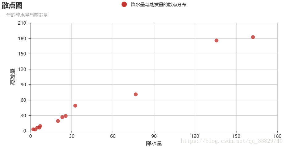
 散点图-scatter
from pyecharts import Scatter
scatter = Scatter("散点图", "一年的降水量与蒸发量")
//xais_name是设置横坐标名称,这里由于显示问题,还需要将y轴名称与y轴的距离进行设置
scatter.add("降水量与蒸发量的散点分布", data1,data2,xaxis_name="降水量",yaxis_name="蒸发量",
            yaxis_name_gap=40)
scatter.render()
图表布局 Grid
由于标题与图表是属于两个不同的控件,所以这里必须对下方的图表Line进行标题位置设置,否则会出现标题重叠的bug。
from pyecharts import Grid
//设置折线图标题位置
line = Line("折线图","一年的降水量与蒸发量",title_top="45%")
line.add("降水量", columns, data1, is_label_show=True)
line.add("蒸发量", columns, data2, is_label_show=True)
grid = Grid()
//设置两个图表的相对位置
grid.add(bar, grid_bottom="60%")
grid.add(line, grid_top="60%")
grid.render()<strong>
<img data-fr-image-pasted="true" alt="" src="https://img-blog.csdn.net/20180816132448610?watermark/2/text/aHR0cHM6Ly9ibG9nLmNzZG4ubmV0L3FxXzMzODI5NzQw/font/5a6L5L2T/fontsize/400/fill/I0JBQkFCMA==/dissolve/70" style="width: 700%;" /></strong>
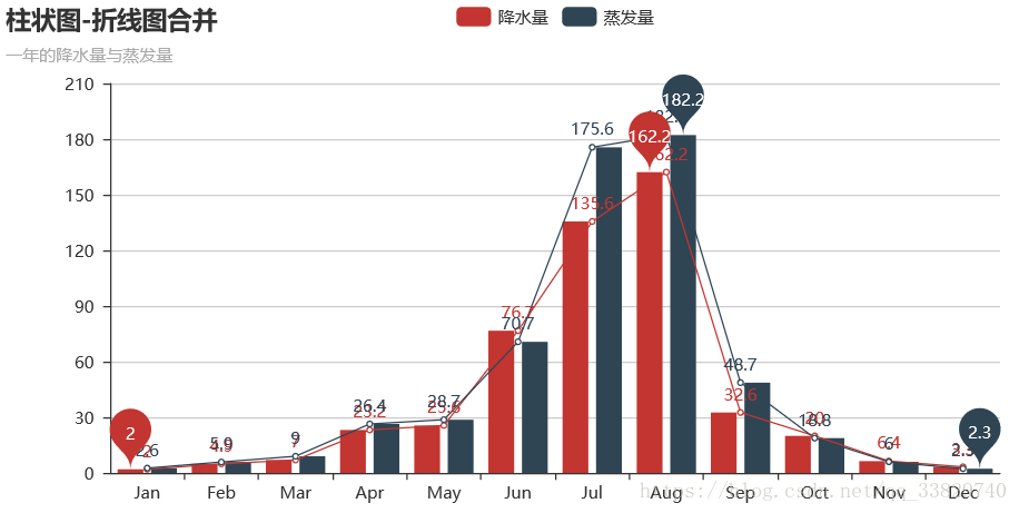
两图结合 Overlap
from pyecharts import Overlap
overlap = Overlap()
bar = Bar("柱状图-折线图合并", "一年的降水量与蒸发量")
bar.add("降水量", columns, data1, mark_point=["max", "min"])
bar.add("蒸发量", columns, data2, mark_point=["max", "min"])
overlap.add(bar)
overlap.add(line)
overlap.render()
- 导入相关图表包
- 进行图表的基础设置,创建图表对象
- 利用add()方法进行数据输入与图表设置(可以使用print_echarts_options()来输出所有可配置项)
- 利用render()方法来进行图表保存
pyecharts还有许多好玩的3D图表和地图图表,个人觉得地图图表是最好玩的,各位有兴趣可以去pyecharts的使用手册查看,有中文版的非常方便: pyecharts
参考资料:
pyecharts使用手册: http://pyecharts.org/#/?id=pyecharts
才学疏浅,欢迎评论指导
欢迎前往我的个人小站: www.wengjj.ink
Recommend
About Joyk
Aggregate valuable and interesting links.
Joyk means Joy of geeK