

The Second Round Of Libre Office Mascot Selection Is On, And It's Still Complete...
source link: https://www.reddit.com/r/linuxmasterrace/comments/7d1igq/the_second_round_of_libre_office_mascot_selection/
Go to the source link to view the article. You can view the picture content, updated content and better typesetting reading experience. If the link is broken, please click the button below to view the snapshot at that time.
both the ones that were rejected look amazing, why were they rejected?
Seriously, it's like they don't want an appealing mascot. I think half of the reason I gave Krita a spin was because of Kiki.
Maybe Calligra can adopt Libbie instead.
That cockatoo was fucking ace, they really screwed the pooch here. I’ve already checked out.
fuck, these designs are really really bad
They should just use dickbutt. Dickbutt is always there working in the background, just like libre software.
That penguin is an exact fucking trace. The first birb with the little horns was an absolutely beautiful design.
Wasn't one of the rules it had to be original? It's clearly ripped off stock art. And the new color scheme makes me think the author is color blind. I went ahead and emailed the original artist to let them know that their work may be ripped off.
Cockatoo and Libbie both rejected
That's some bullshit right there.
Libbe was the best one.
I think the parrot one is a clear winner, it's a real shame it's not in the game anymore. It's cute, professional, easily recognizable, the placement over the already established TDF icon is clever.
the placement over the already established TDF icon is clever
It's the reason it was removed. Come on LO people, just imagine it was a stick and not the logo and it would still be the best submission by far.
why does that URL exist
why did someone buy that domain name
i am so confused
this is why i hate suzaku
2 ugly octopuses, a retarded penguin, green Arthur, 5 uninspired birds. Lol
The third one is the only one I like that isn't plagiarized.
Now this is tragic comedy in its finest.
D'aww, I actually liked Libbie
At least the anime girl is out
yeah anime girls belong on my wallpaper not on my libreoffice logos
come on people
... well fucking lol to that.
Thank you so much for posting this.
Why are so many just this damn birds, there are other animals out there. Why dont yall just pick a recently listed endangered mammal. That's what ubuntu does
This is such a shitshow. I am furry trash and was really rooting for Libbie because of how fucking adorable it is (Krita much lol), and I think the next best thing was the bird with document types as feathers (first link in the post). What the fuck are they doing?
Libbie and Krita's mascot were actually designed by the same person, so it's not surprising that they have similarities. He also did the mascot for Kate and redesigned KDE's mascot too.
What the fuck is going at the Document Foundation?
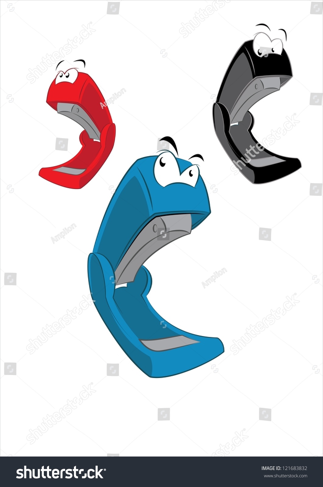
Why not submit a red Swingline stapler icon? A not so subtle Office Space reference and better than some half assed attempts with borrowed artwork. Make it cartoonish...similar to this:
https://image.shutterstock.com/z/stock-vector-cartoon-stapler-121683832.jpg
How about a smiling paperclip?
LIBBIE OR RIOT
It's kinda interesting the designer of that also did the KDE and Krita mascots. Interestingly, he's also doing the art for Freedom Planet 2 (Indies and Linux unite). It would kinda have been nice if he had his design for LibreOffice, but I guess people (I think me included, I was kinda stupid with my decisions) dismissed it as too anime-ish for an office tool.
▀ _ ▀ ---E
Wow, this is sad.. I like the parrot...
Recommend
About Joyk
Aggregate valuable and interesting links.
Joyk means Joy of geeK